The difference between a touchscreen that captivates users and one that frustrates them often has little to do with hardware quality or display resolution. Instead, it comes down to design—the thoughtful consideration of how users will interact with your content, what will motivate them to engage deeply rather than tap once and walk away, and how the entire experience flows from initial curiosity through meaningful exploration to satisfying conclusion.
In educational institutions, corporate environments, museums, and public spaces worldwide, touchscreen displays have become ubiquitous. Yet many installations fail to live up to their potential, serving as expensive digital bulletin boards rather than the engaging interactive experiences they could become. Poorly designed touchscreen experiences suffer from confusing navigation, overwhelming information density, unresponsive interactions, and content that fails to reward the effort users invest in exploration.
Creating touchscreen experiences that truly engage users requires understanding the unique psychology of touch interaction, applying proven user experience design principles adapted for large-format displays, developing content strategies that balance information depth with intuitive access, and implementing accessibility considerations ensuring all users can participate meaningfully regardless of ability.
Whether you’re designing recognition displays for schools, wayfinding systems for complex facilities, information kiosks for public spaces, or interactive exhibitions for visitor centers, the principles of effective touchscreen design remain consistent. This comprehensive guide explores the strategic, creative, and technical considerations that separate mediocre touchscreen implementations from exceptional experiences that captivate audiences and deliver measurable value.
Well-designed touchscreen interfaces invite intuitive interaction through clear visual hierarchies and responsive feedback
Understanding Touch Psychology: Why Users Interact With Screens
Before diving into specific design techniques, understanding the psychological factors that motivate—or discourage—touchscreen interaction provides essential foundation for creating engaging experiences.
The Curiosity Factor and Initial Engagement
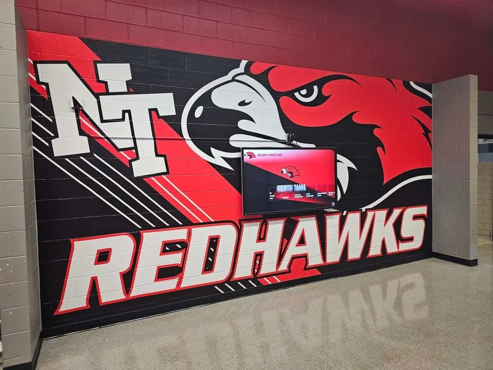
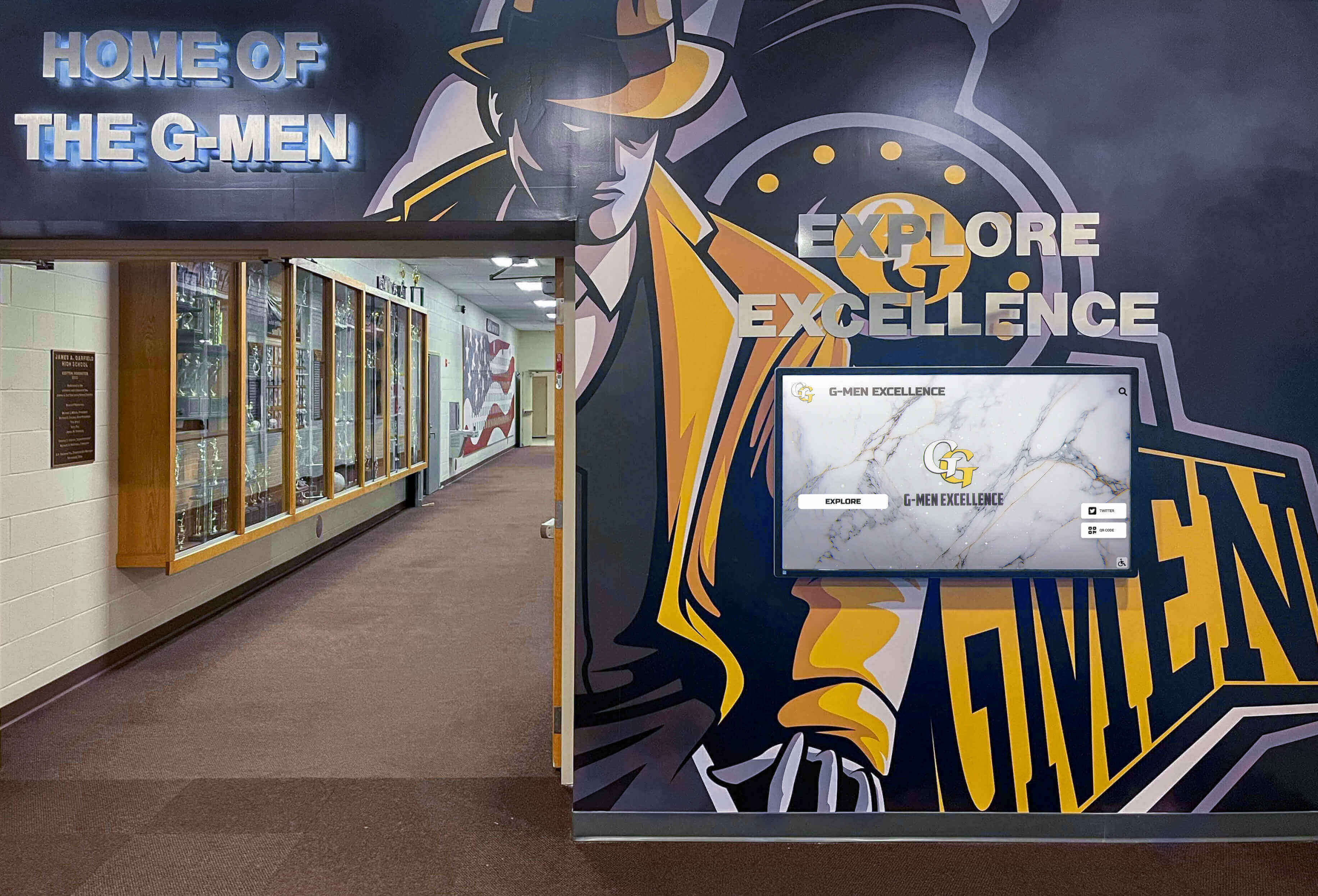
Humans are naturally curious creatures, particularly when encountering interactive technology in unexpected contexts. A thoughtfully designed touchscreen display in a school hallway or building lobby triggers curiosity that static displays cannot match. The mere presence of an illuminated, professional-looking screen suggests there’s something worth discovering.
However, initial curiosity alone doesn’t guarantee engagement. Users make rapid judgments—often within 3-5 seconds—about whether an interactive experience is worth their time. During this critical window, your touchscreen must communicate several things clearly: what information or value it offers, how to begin interacting, and that the experience will reward rather than waste their time.
First Impression Elements that capture attention include dynamic content that shows clear activity rather than static images, prominent interactive elements that signal touchability, clear welcome messaging that explains purpose, and visual quality that conveys professionalism and institutional credibility.
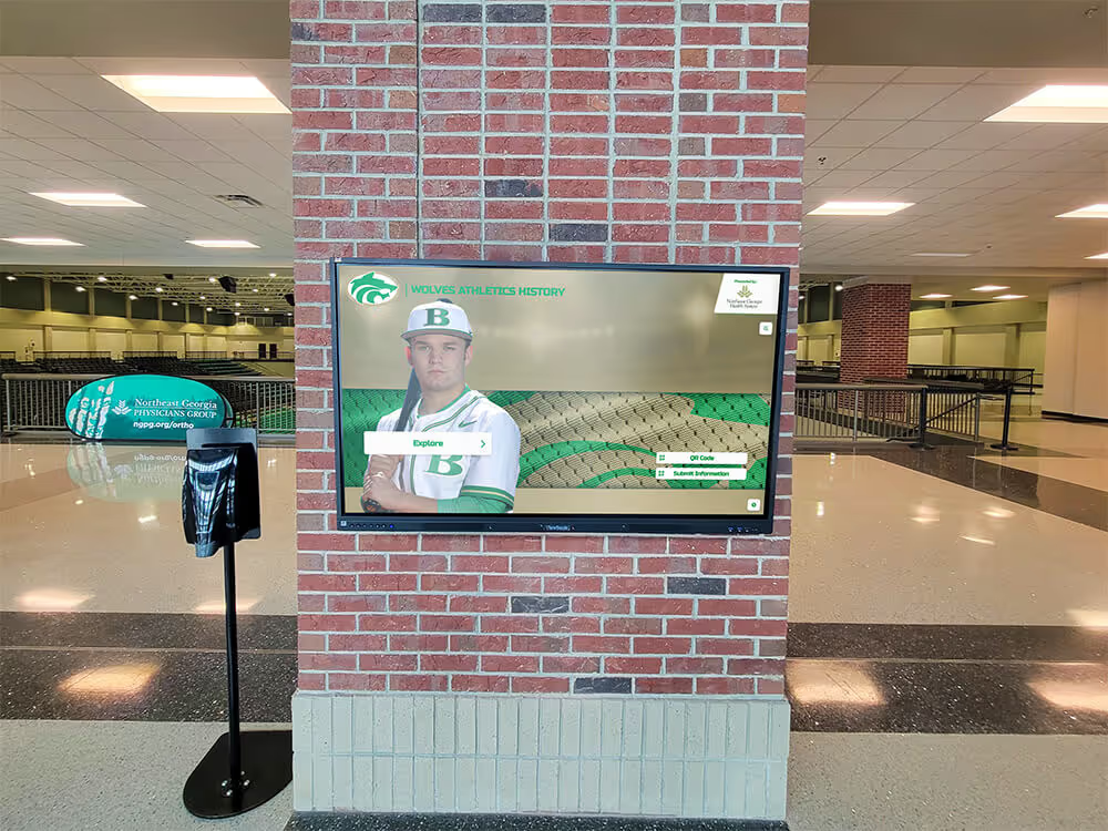
Solutions like Rocket Alumni Solutions understand this psychology, designing interfaces that immediately communicate their purpose while inviting exploration through visually compelling layouts that reward initial curiosity with relevant, well-organized content.
The Reward Cycle: Maintaining Sustained Engagement
Once users begin interacting, maintaining engagement requires creating reward cycles where each interaction delivers satisfying feedback and reveals additional content worth exploring. This psychological principle—borrowed from game design and successful consumer applications—keeps users engaged beyond initial curiosity.
Effective Reward Cycles include immediate visual feedback confirming every touch interaction, progressive disclosure revealing deeper content layers gradually, discovery moments where users find unexpected connections or interesting information, and personalization that makes content feel relevant to individual interests.
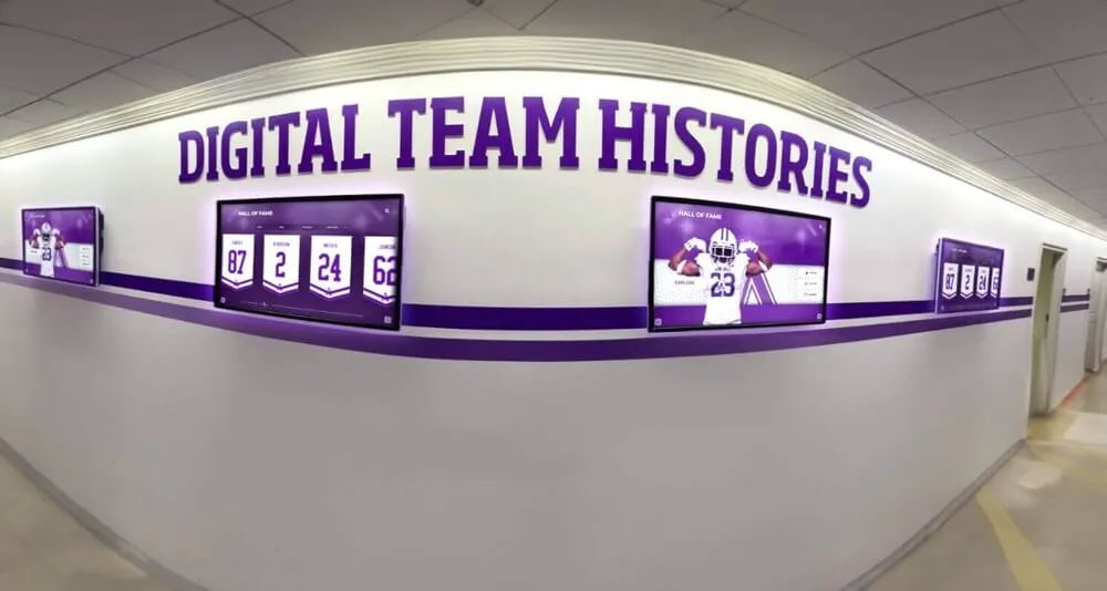
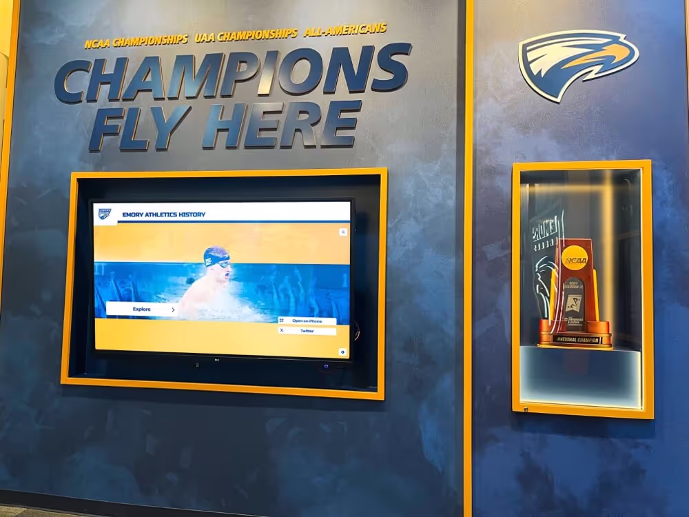
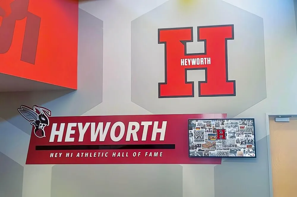
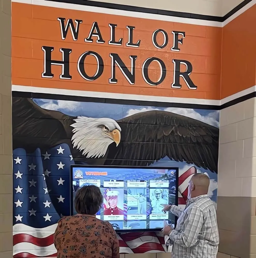
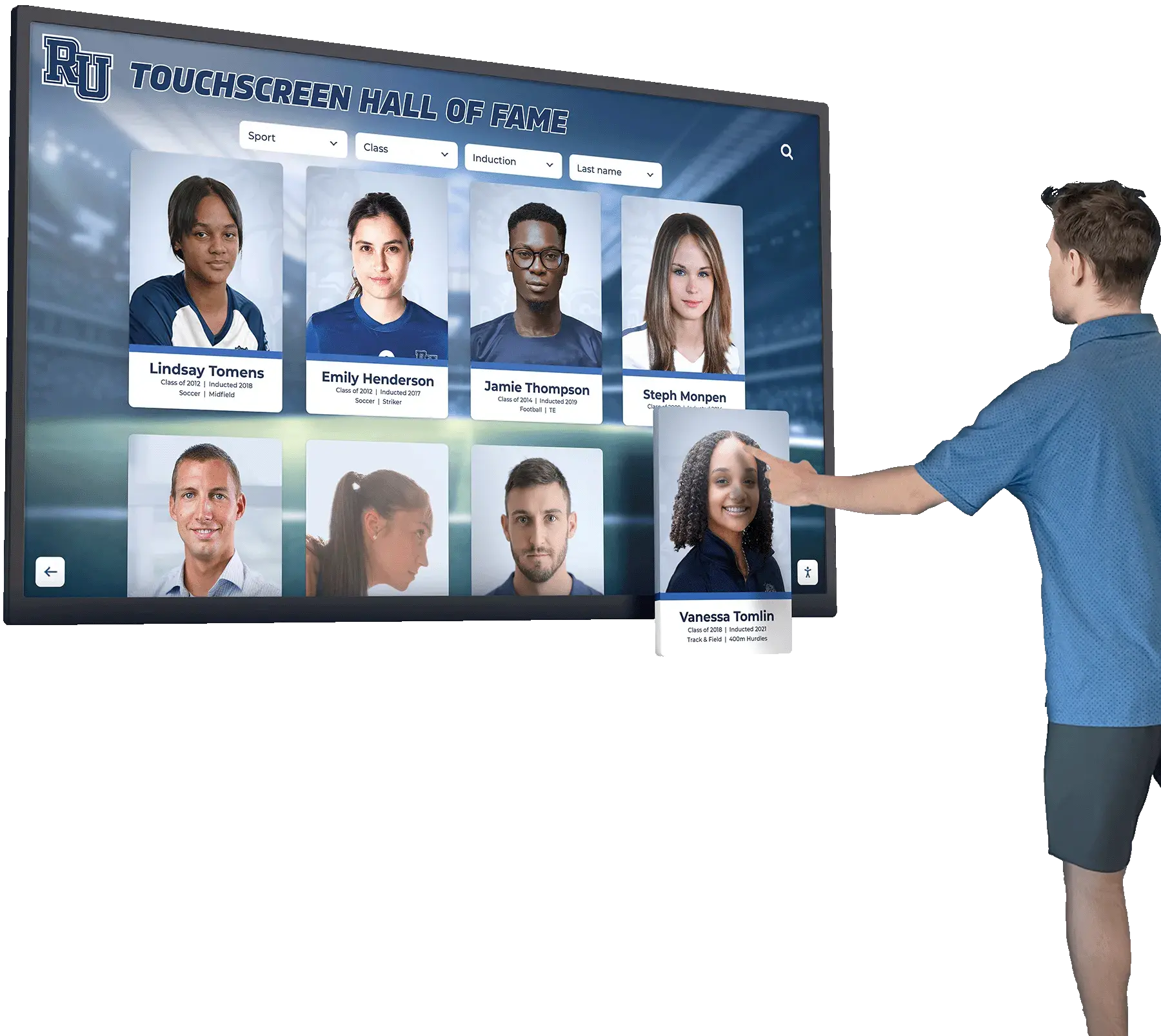
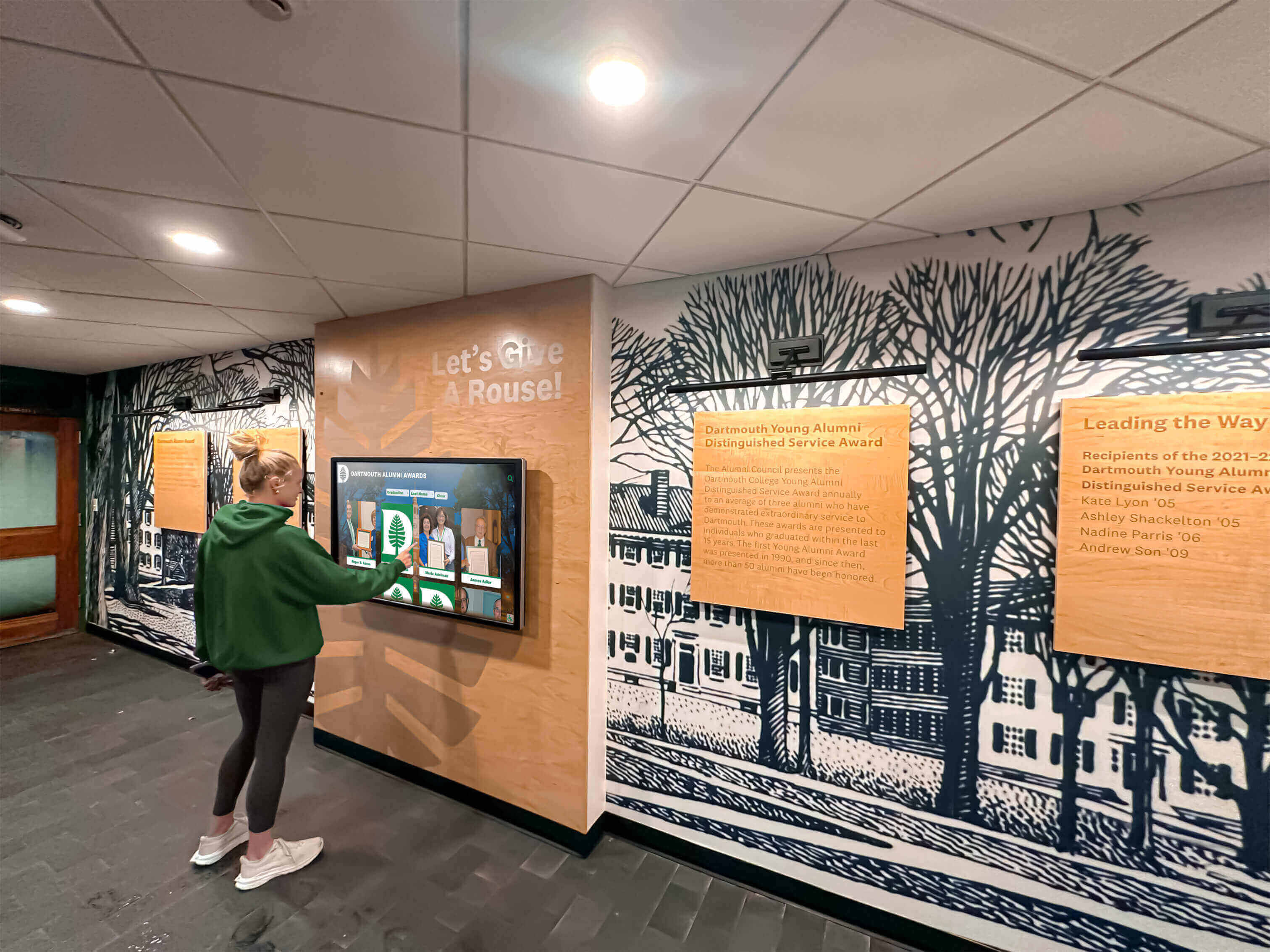
Consider how digital recognition displays in schools leverage this principle. Users might search for their own name or graduation year, receiving immediate gratification when finding themselves. This personal connection motivates continued exploration—finding classmates, comparing achievements across years, or discovering school history they didn’t know existed. Each discovery rewards previous effort while suggesting additional exploration opportunities.
Social Factors Influencing Touchscreen Usage
Touchscreen displays in public or semi-public spaces create unique social dynamics. Unlike personal device interactions that occur privately, public touchscreen usage happens in view of others. This visibility influences user behavior in important ways designers must consider.
Social Considerations include perceived observation pressure discouraging extended interaction when others are waiting, performance anxiety about appearing technologically incompetent if interaction proves difficult, social validation when interesting discoveries prompt sharing with companions, and demonstration effects where watching others interact reduces barriers for subsequent users.
Design choices can either amplify social friction or leverage social dynamics positively. Clear, intuitive navigation reduces anxiety about appearing incompetent. Shareable content encourages users to involve companions, transforming individual interaction into group experience. Multi-user features enabling simultaneous interaction by several people eliminate waiting pressure while creating collaborative discovery opportunities.
Public touchscreen installations should accommodate social interaction patterns and varying user confidence levels
Core UX Principles for Touchscreen Design
Effective touchscreen experiences apply fundamental user experience design principles adapted for the unique characteristics of large-format touch interaction in public or semi-public contexts.
Interface Clarity and Visual Hierarchy
Unlike smartphone or tablet apps where users have sustained attention and private context, public touchscreen interfaces must communicate purpose and navigation instantly to users who may interact for only seconds or minutes.
Visual Hierarchy Fundamentals include prominent primary actions using size, color, and position to emphasize most important interactions, clear information grouping organizing related content visually, consistent styling maintaining predictable patterns throughout the experience, and strategic whitespace preventing overwhelming density that discourages engagement.
Typography selections significantly impact usability. Text must remain legible from varying distances—users may stand close to interact but also view from several feet away when deciding whether to approach. Font sizes should generally be 20% larger than comfortable for desktop applications, with critical labels and headings even larger. Sans-serif typefaces typically provide better readability at display sizes than serif alternatives.
Color choices must account for viewing conditions that vary throughout the day. Displays in locations with natural lighting may experience glare at certain times. High contrast ratios between text and backgrounds ensure readability across lighting conditions. Color-coding can aid navigation, but information shouldn’t rely solely on color distinctions since colorblind users may struggle to differentiate.
Navigation Structures should be immediately apparent without requiring instruction. Common patterns users recognize from other touchscreen experiences create intuitive starting points. Persistent navigation elements that remain accessible from any screen prevent users from feeling trapped in content dead-ends without clear exit paths.
Touch Target Sizing and Spacing
The physical characteristics of human fingers impose important constraints on touch interface design that differ significantly from mouse-driven desktop interfaces or stylus-based systems.
Adult finger pads typically measure 10-15mm in width when touching surfaces. To ensure reliable interaction without accidental activation of adjacent elements, touchable elements should meet minimum size requirements while maintaining adequate spacing from neighboring interactive elements.
Touch Target Guidelines recommend minimum button dimensions of 15mm (approximately 57 pixels at typical touchscreen resolutions), preferred dimensions of 20mm (approximately 75 pixels) for primary actions, spacing between interactive elements of at least 8mm (approximately 30 pixels), and larger targets for users with motor impairments or when targeting accuracy matters critically.
These specifications may seem enormous compared to desktop interface conventions, but undersizing touch targets creates frustrating experiences where users repeatedly miss intended targets or accidentally trigger wrong actions. The physical nature of touch interaction requires design constraints respecting human anatomy rather than purely visual considerations.
Edge placement of interactive elements requires special attention. Screen edges and corners are easiest to target accurately through a principle called Fitts’s Law—targets with infinite or bounded dimensions in one or more directions require less precision than targets surrounded by inactive space. However, corners may be difficult to reach on very large displays unless mounted at appropriate heights.
Response Time and Feedback Mechanisms
Touch interactions feel fundamentally different from mouse clicks. Direct physical contact with interface elements creates expectations for immediate response that mirror real-world object manipulation. Delays between touch and visible response break this mental model, creating frustrating disconnection between action and consequence.
Response Requirements include visual feedback within 100 milliseconds of touch contact, completion of simple actions within 1 second, progress indicators for operations requiring 2+ seconds, and clear confirmation of system states after all user actions.
Feedback can take multiple forms beyond simple visual changes. Subtle animations showing transitions between states, haptic vibration confirming selections (on capable hardware), audio cues providing additional confirmation, and persistent indicators showing current location within content hierarchies all contribute to responsive feel that encourages continued interaction.
Animations should enhance rather than delay user flow. Brief, purposeful transitions provide satisfying feedback while communicating relationships between interface states. However, decorative animations that delay access to requested content frustrate users and encourage abandonment. Every animated element should either provide functional feedback or communicate meaningful information—never simply fill time.
Responsive interfaces with clear visual feedback create satisfying interaction experiences that encourage exploration
Content Strategy for Engaging Touchscreen Experiences
Even perfectly designed interfaces fail without compelling content organized for intuitive access and progressive exploration. Content strategy determines what information your touchscreen presents and how users navigate through it.
Information Architecture and Navigation Design
The structure underlying your content significantly impacts whether users can find information they seek or become lost in confusing organizational schemes that obscure rather than reveal valuable content.
Effective Information Architecture includes shallow hierarchies limiting navigation depth to 3-4 levels maximum, logical categorization grouping related content in ways users intuitively expect, multiple access paths providing alternative routes to important content, and persistent orientation elements helping users understand current location and available navigation options.
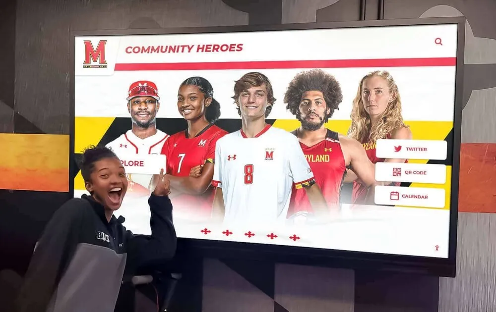
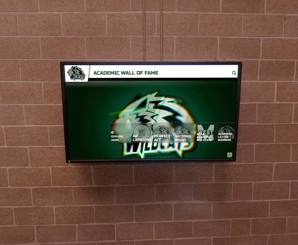
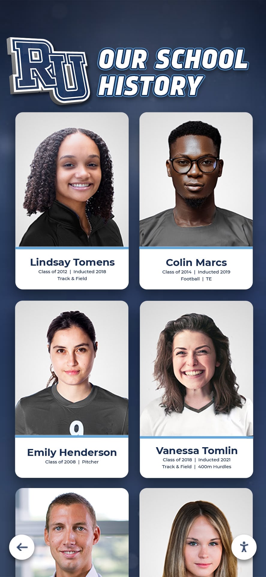
Consider recognition displays showcasing school achievements. Users might seek information through multiple pathways: browsing by decade, searching by name, filtering by sport or activity, or exploring championship teams. Well-designed systems accommodate these various mental models rather than forcing single navigation approaches that only serve users thinking in predetermined ways.
Category naming requires careful consideration. Labels should be self-explanatory using terminology your audience naturally understands rather than institutional jargon or clever creative names requiring interpretation. Testing category structures with representative users reveals whether organizational logic that seems obvious to designers actually matches audience mental models.
Search Functionality proves essential for content-rich touchscreen experiences. While browse-based navigation serves users exploring generally, those seeking specific information need direct access. Search interfaces on touchscreens face unique constraints—typing on virtual keyboards proves cumbersome compared to physical keyboards, so search should offer autocomplete suggestions reducing required input. Filtering options enable search refinement without additional typing. Recent search display shows popular queries, potentially eliminating typing entirely for common requests.
Content Depth and Progressive Disclosure
Touchscreen experiences must balance comprehensive information with overwhelming density. Presenting everything simultaneously creates cluttered interfaces that discourage rather than invite exploration. Progressive disclosure—revealing information gradually as users demonstrate interest—solves this tension elegantly.
Progressive Disclosure Techniques include summary views showing key information with expansion options for details, layered navigation revealing subcategories only when users select primary categories, detail overlays displaying comprehensive information without navigating away from context, and related content suggestions appearing after users engage with specific items.
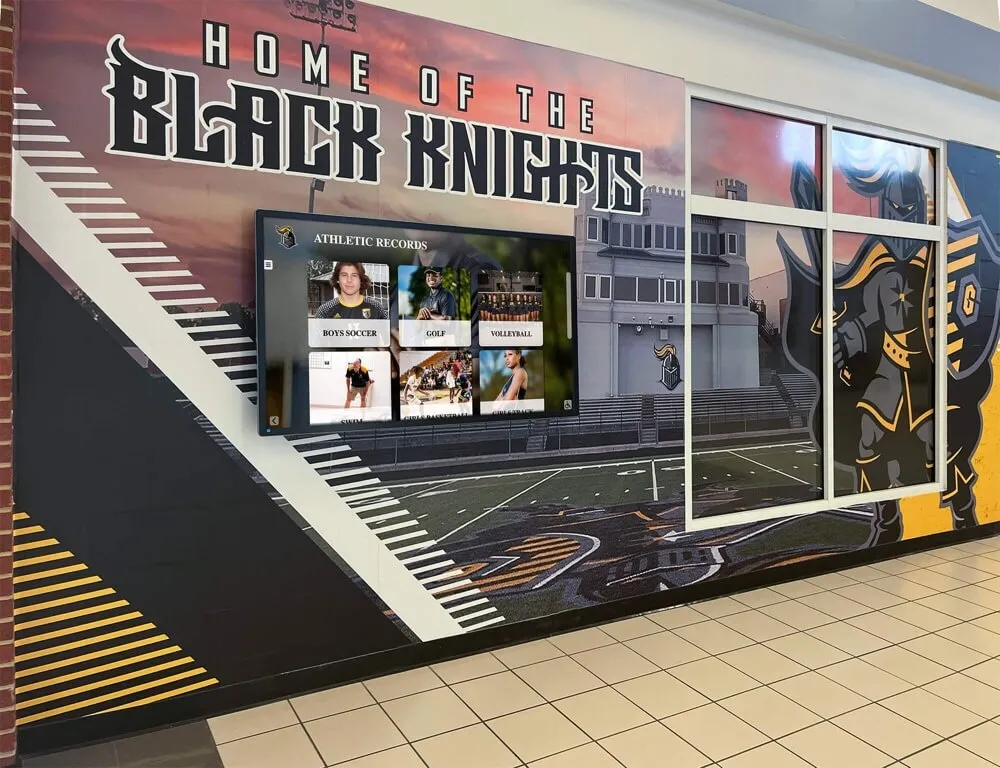
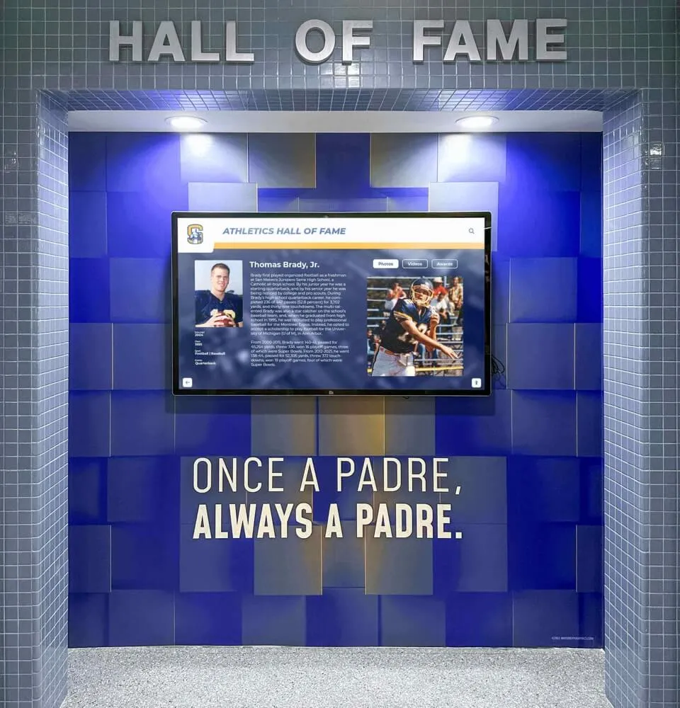
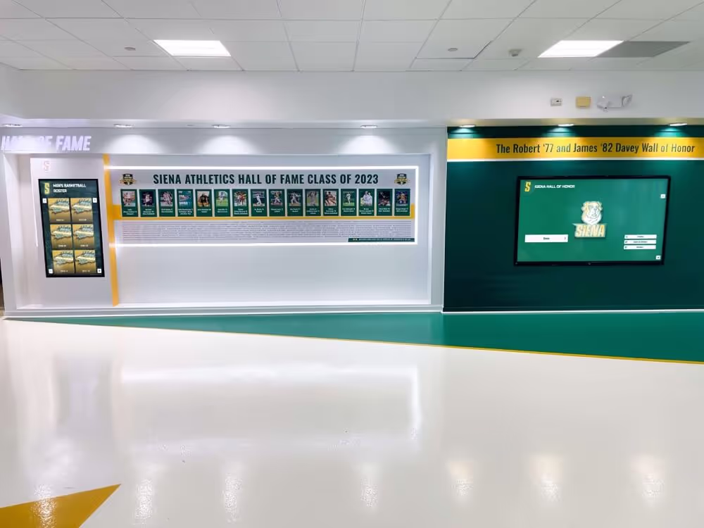
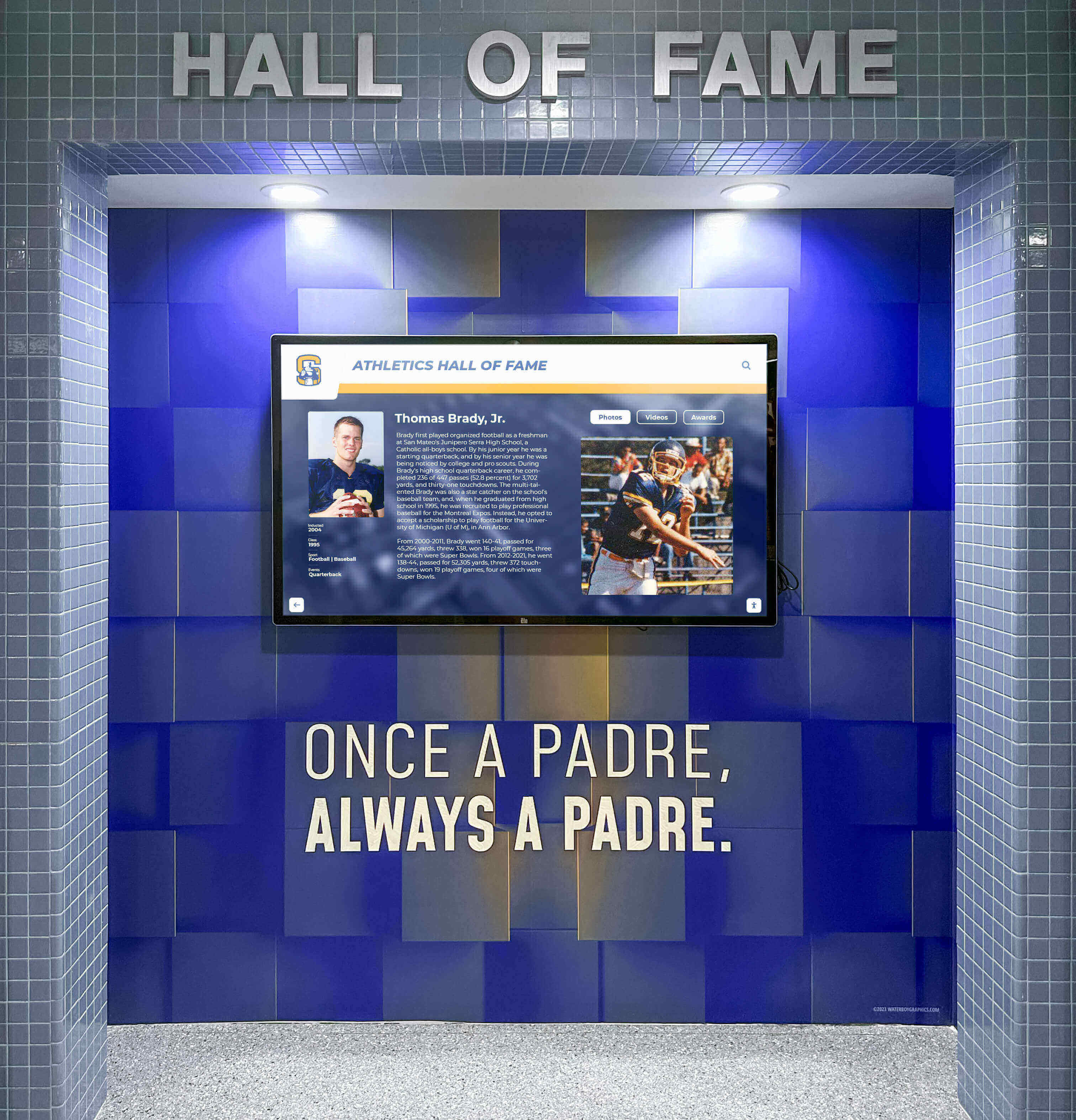
For example, interactive recognition programs might initially display honoree grids showing names and photos. Selecting an individual reveals a detailed profile with biography, achievements, photos, and videos. From this detailed view, users might access related content like teammates, other honorees from the same year, or similar achievements—each layer providing more depth without overwhelming the initial presentation.
This approach respects user attention and motivation. Casual browsers receive sufficient information without commitment to deep exploration. Highly motivated users can access comprehensive details through clear progressive paths. Everyone experiences appropriate information density matching their interest level and available time.
Multimedia Integration and Content Variety
Touchscreens’ multimedia capabilities transform them from text-and-photo displays into rich storytelling platforms. Strategic multimedia integration creates more engaging experiences while accommodating diverse learning and engagement preferences.
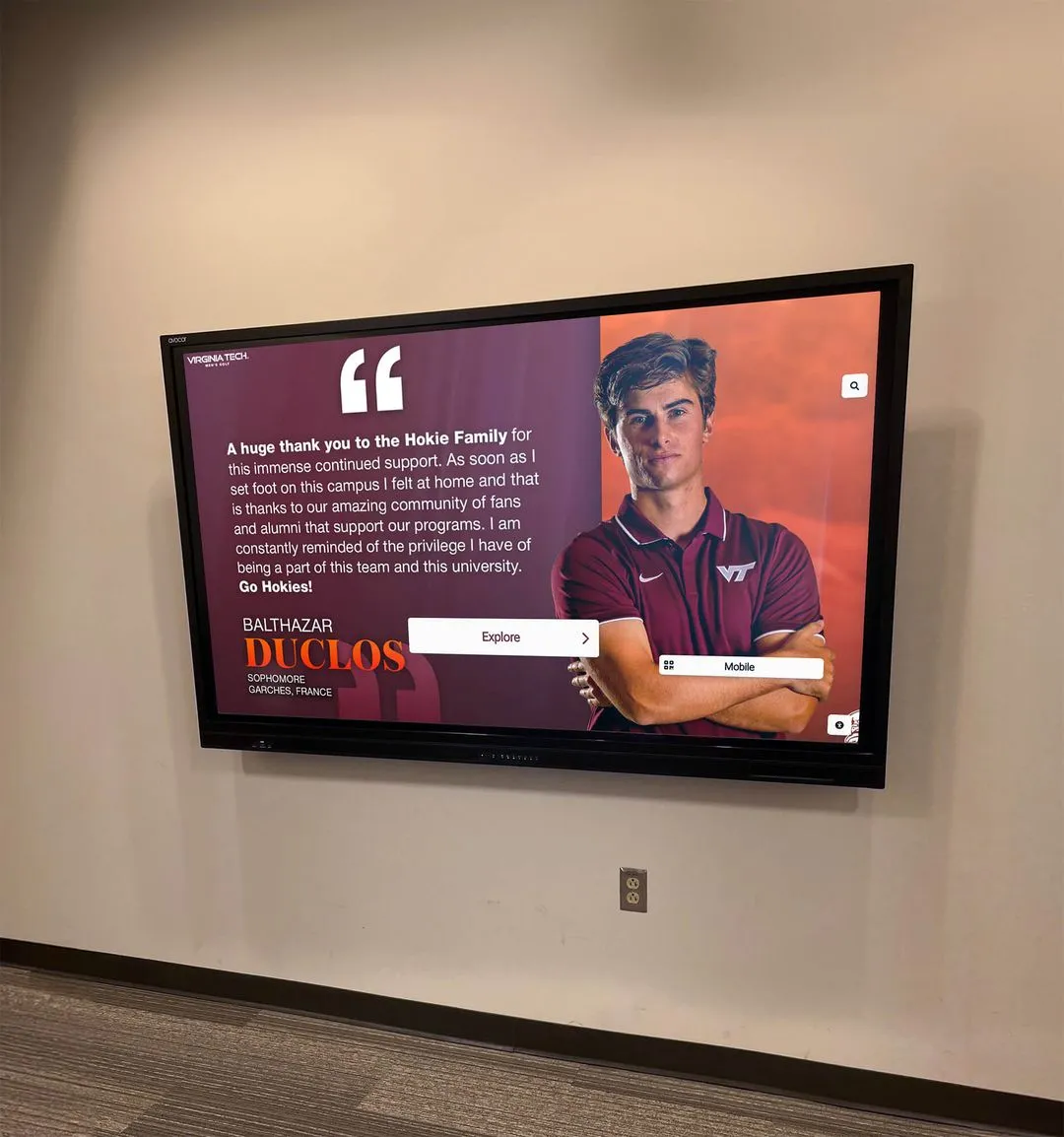
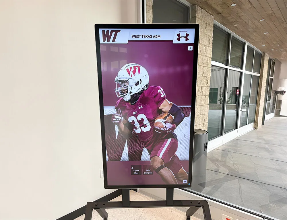
Effective Multimedia Elements include professional photography establishing emotional connections and providing recognition, video content bringing stories and achievements to life through motion and sound, audio narration enabling hands-free information consumption, interactive visualizations making complex data explorable and understandable, and document viewers providing access to detailed supporting materials.
Video content particularly enhances recognition displays. Athletic highlights, performance footage, interview clips, and documentary-style profiles create emotional resonance that static photos and text cannot match. Schools can showcase championship moments, graduation speeches, theatrical performances, or student testimonials celebrating programs and achievements.
However, multimedia requires thoughtful implementation. Autoplay audio can be disruptive in public spaces, so video and audio should play only when users specifically request. File sizes and streaming requirements impact performance and require adequate bandwidth. Alternative formats should accommodate users who prefer text or cannot hear audio clearly in noisy environments.
Content variety prevents monotony across large content collections. Mix detailed profiles with shorter highlights, combine individual recognition with team achievements, and alternate between historical content and current updates. This variety maintains interest across extended browsing sessions while demonstrating the comprehensiveness of your recognition program.
Compelling content organized intuitively transforms casual interactions into engaged exploration sessions
Accessibility Design for Inclusive Touchscreen Experiences
Truly engaging experiences must engage all users, including those with disabilities that affect how they interact with technology. Accessibility isn’t an optional feature or afterthought—it’s fundamental to effective design while often being legally required through regulations like the Americans with Disabilities Act.
Physical Accessibility Considerations
The physical installation of touchscreen displays significantly impacts who can use them effectively. Mounting height, approach space, and surrounding environment all affect accessibility for users with mobility impairments or who use wheelchairs.
Physical Accessibility Guidelines include mounting touchscreen centers at 48 inches above floor level when possible, ensuring clear floor space of at least 30x48 inches in front of displays for wheelchair approach, confirming that all interactive elements fall within 15-48 inch vertical reach range, and providing adequate space for wheelchair users to position themselves comfortably for extended interaction.
Kiosk-style installations should consider whether users might remain engaged for extended periods. If so, providing seating options or designing for comfortable standing interaction becomes important. Displays in wayfinding applications serve users who may be elderly or have limited stamina, making comfort during interaction particularly important.
Touchscreen displays should also be positioned to minimize glare from windows or overhead lighting that might make screens difficult to view for users with visual impairments. Consideration of viewing angles ensures screens remain visible from seated positions as well as standing.
Visual Accessibility Features
Visual impairments range from complete blindness to color blindness to low vision requiring magnification. Comprehensive accessibility addresses this spectrum through multiple accommodations.
Visual Accessibility Elements include high contrast modes offering stark distinctions between text and backgrounds, text sizing controls enabling user-adjustable font sizes, screen reader compatibility allowing assistive technology to convey information through audio, and color-independent information coding ensuring meaning doesn’t rely solely on color distinctions.
Text contrast ratios should meet Web Content Accessibility Guidelines (WCAG) AA standards minimum of 4.5:1 for normal text and 3:1 for large text (18pt+). Many organizations target stricter AAA standards of 7:1 for normal text. Contrast checking tools can verify whether color combinations meet accessibility requirements before implementation.
Icon usage requires careful accessibility consideration. Icons should always pair with text labels rather than standing alone, as visual symbols may not be universally understood. Users with cognitive disabilities or from diverse cultural backgrounds might interpret icons differently than designers intend.
Motion sensitivity affects some users negatively. Interfaces should avoid rapid flashing that can trigger photosensitive epilepsy. Users should be able to disable or reduce animated elements if motion causes discomfort or distraction. Auto-playing carousel-style content rotation creates accessibility problems for users who need more time to read or who use assistive technology that can’t keep pace with automatic changes.
Cognitive Accessibility and Usability
Cognitive disabilities, learning differences, and conditions affecting attention and memory require design considerations extending beyond physical and sensory accommodations.
Cognitive Accessibility Practices include simplified language avoiding unnecessary jargon or complex vocabulary, clear information hierarchy making relationships between content elements obvious, consistent navigation patterns reducing cognitive load of learning new interaction models on each screen, and generous timing without automatic timeouts that penalize users who need more time to read or make decisions.
Instructions should be concise and unnecessary when possible. The best touchscreen interfaces are self-evident through clear visual design rather than requiring explanatory text. When instructions are necessary, they should use simple imperative language: “Tap to learn more” rather than “Additional information can be accessed through selection of this element.”
Error prevention proves more valuable than error handling. Design choices that make mistakes difficult—like requiring confirmation for destructive actions or disabling invalid options rather than showing error messages after invalid selections—create better experiences for all users while particularly benefiting those with cognitive disabilities who may find error recovery stressful or confusing.
Recovery from errors should be straightforward and forgiving. Persistent navigation providing clear paths back to known starting points prevents users from feeling trapped. Undo functionality allows experimentation without fear of irreversible consequences. Clear “start over” or “return to beginning” options provide psychological safety encouraging exploration.
Accessible design benefits all users through clear hierarchies, readable text, and intuitive navigation patterns
Technical Implementation Considerations
Design excellence must be supported by solid technical implementation that maintains performance, reliability, and quality across various operating conditions and usage patterns.
Performance Optimization for Smooth Interaction
Users expect immediate response to touch interactions. Technical performance problems—laggy scrolling, delayed button responses, or stuttering animations—undermine even the most thoughtfully designed experiences by breaking the connection between user action and system response.
Performance Optimization Strategies include asset optimization reducing image and video file sizes without visible quality degradation, lazy loading delaying download of off-screen content until needed, local caching storing frequently accessed content on the device rather than repeatedly downloading, and efficient code minimizing processing overhead for interaction handling and animation rendering.
Image optimization deserves particular attention in touchscreen applications that often feature photo-heavy content. Modern compression algorithms and format choices (like WebP or AVIF for photos) dramatically reduce file sizes while maintaining visual quality. Responsive images serving appropriately sized versions based on display resolution prevent downloading massive files that slow performance without providing visible benefit on lower-resolution screens.
Animation performance requires attention to technical implementation details. Hardware-accelerated CSS animations using transform and opacity properties perform far better than animated properties that trigger layout recalculation. Sixty frames per second should be the minimum target for animation smoothness—users notice and are bothered by stuttering animations below this threshold.
Content Management and Update Workflows
The most sophisticated touchscreen experience provides little value if content becomes outdated because updating it requires technical expertise or proves too time-consuming for busy administrators.
Effective touchscreen software includes intuitive content management systems enabling non-technical staff to update content efficiently. Key features should include web-based administration accessible from any computer, template-driven content entry reducing formatting decisions, drag-and-drop file uploading eliminating technical file management, and WYSIWYG preview showing exactly how content will appear on displays before publication.
Scheduled publishing allows administrators to prepare content in advance and schedule automatic publication at appropriate times. This capability proves particularly valuable for recognition programs that induct new members annually or schools updating displays to coincide with events and milestones.
Version history and rollback capabilities provide safety nets when updates inadvertently introduce errors or when content revisions need reversal. Audit trails showing who made changes and when support accountability in multi-administrator environments.
Hardware Selection and Compatibility
Software design must consider the hardware platforms that will run touchscreen experiences. Hardware capabilities and limitations significantly impact what design approaches prove feasible.
Hardware Considerations include display resolution and size affecting content density and touch target sizing, touch technology (capacitive vs. resistive) determining interaction precision and multi-touch support, processing power impacting animation smoothness and content rendering speed, and environmental factors like temperature, humidity, and lighting conditions affecting display visibility and component longevity.
Commercial-grade displays designed for 24/7 operation in public spaces provide significantly better longevity and reliability than consumer-grade televisions. While commercial displays cost more initially, their durability and warranty coverage typically provide better long-term value for installations running continuously.
Anti-glare coatings or screen protectors may be necessary in locations with significant natural light. Positioning relative to windows and lighting fixtures should be considered during planning phases rather than discovered as problems after installation.
Touch technology capabilities affect what interaction gestures your design can support. Multi-touch capacitive screens enable pinch-to-zoom, rotation, and other multi-finger gestures that create intuitive interactions. Less expensive resistive touchscreens typically support only single-touch interaction, limiting design possibilities but potentially offering better durability in high-traffic environments where screens receive rough treatment.

Technical implementation quality ensures designs perform reliably across varying conditions and sustained usage
Common Touchscreen Design Mistakes and How to Avoid Them
Many touchscreen implementations suffer from preventable design mistakes that undermine user experience and limit effectiveness. Learning from common pitfalls helps create better experiences while avoiding wasted implementation effort.
Mistake: Desktop or Mobile Design Simply Transferred to Touchscreens
Perhaps the most common error involves taking interfaces designed for desktop computers or mobile phones and deploying them on touchscreens without adaptation to the unique context of large-format touch interaction.
Desktop interfaces assume mouse pointers that enable hover states, precise pixel-level targeting, and interaction from comfortable seated positions. Mobile interfaces assume personal devices used privately in brief sessions with strong motivation to complete specific tasks. Public touchscreen contexts differ fundamentally from both—no hover state, less precise touch targeting, standing interaction from varying distances, and casual exploration rather than task-driven usage.
Solution Approach: Design specifically for the touchscreen context from the beginning rather than adapting existing interfaces. Touch targets should be larger than mobile app equivalents because touchscreens receive less precise interaction from users standing at varying distances. Navigation depth should be shallower than desktop sites because users have less patience for deep exploration when standing. Content density should balance mobile brevity with desktop comprehensiveness—more than mobile, less than desktop.
Purpose-built touchscreen display solutions designed specifically for public interactive installations avoid these adaptation problems by building from appropriate foundations rather than retrofitting unsuitable interfaces.
Mistake: Information Overload and Cluttered Interfaces
The temptation to showcase all available information simultaneously creates overwhelming interfaces that discourage rather than invite engagement. Users confronting dense walls of text, crowded layouts, or unclear navigation often walk away rather than investing effort to decipher complex presentations.
Solution Approach: Embrace progressive disclosure and visual hierarchy. Start with clear, simple entry points that communicate core value and basic organization. Reveal additional depth only as users demonstrate interest through interaction. Use whitespace generously to create breathing room that makes interfaces feel approachable rather than overwhelming.
Information scent—the principle that users follow trails of promising information—guides effective disclosure strategies. Each level of depth should clearly indicate what additional information lies ahead, allowing users to judge whether deeper exploration serves their interests. Summary views with “learn more” prompts, category listings with entry counts, and preview snippets all provide information scent helping users navigate confidently.
Mistake: Inconsistent or Confusing Navigation
When navigation patterns change unpredictably across different sections or when users cannot determine how to return to known starting points, confusion and abandonment result. Consistency proves essential for intuitive navigation that users can master quickly without extensive learning.
Solution Approach: Establish clear navigation patterns and maintain them consistently throughout the entire experience. Persistent navigation elements—home buttons, search access, main category menus—should remain accessible from every screen in consistent locations. Visual styling should clearly distinguish interactive elements from static content using color, size, and positioning consistently.
Breadcrumb trails showing the path users followed to reach current locations provide orientation and easy backtracking. “Start over” or “return to main menu” options offer psychological safety nets encouraging exploration without fear of becoming hopelessly lost.
Mistake: Neglecting Maintenance and Content Currency
Even brilliantly designed touchscreens fail when content becomes outdated. Stale information, broken links, outdated photos, and abandoned social media feeds communicate institutional neglect and undermine credibility.
Solution Approach: Build content maintenance into operational workflows from the beginning rather than treating it as an afterthought. Assign clear responsibility for content updates to specific individuals or departments. Establish review schedules—quarterly content audits checking for outdated information, broken elements, and opportunities for enhancement prevent drift toward neglect.
Consider whether initial content volume is realistically maintainable. Better to launch with focused, excellent content that will remain current than comprehensive coverage that quickly becomes outdated due to maintenance burden. Sustainable maintenance models often involve distributed responsibility—athletic staff updating sports recognition, development offices managing donor content, alumni offices maintaining alumni profiles—rather than centralizing all content management with single overstretched administrator.
Many schools successfully involve students in content maintenance through journalism programs, technology clubs, or community service opportunities. Student involvement builds engagement while creating sustainable models not solely dependent on limited administrative staff time. Educational institutions can showcase student leadership recognition or academic achievement programs through these collaborative content development approaches.
Well-maintained touchscreen installations demonstrate ongoing institutional commitment and deliver consistent value over years of operation
Measuring Success and Optimizing Touchscreen Engagement
Creating engaging touchscreen experiences requires continuous measurement and optimization rather than one-time design and implementation. Analytics and user feedback inform refinements that progressively improve effectiveness.
Analytics and Usage Metrics
Robust analytics built into touchscreen software provide quantitative evidence about how users actually interact with your installation, revealing patterns that inform strategic content and design decisions.
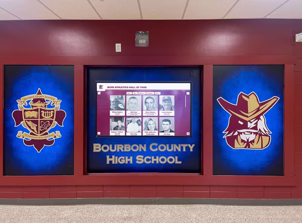
Key Usage Metrics include total interactions tracking overall engagement levels, unique visitors versus repeat users showing whether systems attract sustained interest, session duration indicating depth of engagement, navigation paths revealing how users explore content, popular content identification showing what information resonates most strongly, and search query analysis exposing what information users actively seek.
Schools implementing digital recognition systems can measure which achievement categories attract most interest, what years generate highest engagement, which sports or activities receive most views, and whether users engage more with photos, videos, or text-based content. These insights guide content development priorities and resource allocation.
Time-based patterns reveal when engagement peaks—perhaps during athletic events, lunch periods, or visitor days. Understanding temporal patterns informs content scheduling and can justify staffing or promotional efforts during high-traffic periods.
User Feedback and Observation
Quantitative analytics tell you what users do but not why they behave in particular ways. Qualitative feedback through observation, surveys, or direct conversation provides context that numbers alone cannot reveal.
Feedback Collection Methods include structured observation sessions watching representative users interact and noting confusion points or difficulties, brief intercept surveys asking users about their experience immediately after interaction, feedback buttons within interfaces inviting suggestions and problem reports, and focus groups exploring user needs and reactions to proposed features or content.
Observation proves particularly revealing. Watching actual users interact often exposes usability problems that escaped notice during design and testing. Users may struggle with elements designers assumed were obvious, ignore features that seemed compelling during planning, or create unexpected usage patterns adapting the system to purposes designers didn’t anticipate.
Student feedback in school settings provides valuable perspectives. Current students represent important audiences whose engagement demonstrates that recognition programs resonate with active participants, not just alumni reminiscing about past achievements. Student suggestions often identify content opportunities and features that adults overlook.
A/B Testing and Iterative Improvement
Systematic testing of interface variations enables evidence-based optimization rather than relying on subjective design preferences or unvalidated assumptions.
A/B Testing Applications include navigation structure comparisons testing alternative information architectures, content presentation format experiments comparing visual layouts or media emphasis, search versus browse functionality testing to understand how users prefer accessing content, and feature prioritization experiments varying which capabilities receive prominent positioning.
Testing should focus on meaningful variables that might significantly impact engagement rather than minor visual tweaks. Different opening screens, alternative navigation approaches, or varied content presentation formats represent testable hypotheses worth investigating. Button colors or minor text changes rarely produce impact justifying testing effort.
Iterative design processes incorporate learning from analytics, feedback, and testing into successive design improvements. No touchscreen experience should be considered “finished” after initial launch. Rather, successful implementations evolve continuously based on evidence about what works and what could improve.
Creating Touchscreen Experiences That Stand the Test of Time
The most engaging touchscreen experiences balance current design trends with timeless principles ensuring installations remain effective and relevant through years of operation rather than feeling dated months after launch.
Focus on Timeless Design Fundamentals
While visual design trends change rapidly, fundamental principles of clarity, organization, and usability remain constant. Designs emphasizing these foundations age more gracefully than those chasing momentary stylistic trends.
Timeless Design Principles include clear visual hierarchies making information organization obvious, generous whitespace preventing cluttered density, readable typography at appropriate sizes for context, high-contrast text ensuring legibility, and intuitive navigation requiring minimal learning.
Color palette selections deserve particular attention. Institutional brand colors provide natural starting points while creating consistency with broader organizational identity. However, purely trendy color schemes disconnected from institutional identity may feel dated as design fashions evolve. Classic combinations of analogous or complementary colors prove safer than highly saturated neon palettes currently fashionable but likely to feel aged quickly.
Planning for Long-Term Content Growth
Touchscreen installations typically begin with finite content volumes but grow substantially over years of operation. Design decisions should anticipate this growth rather than optimizing only for initial content quantities.
Growth Accommodations include navigation structures that scale gracefully as categories expand, search and filtering capabilities becoming more valuable as content volume increases, database architectures supporting essentially unlimited content additions, and interface designs that work equally well with hundreds or thousands of entries.
Recognition programs that begin by honoring 50-100 alumni might expand to thousands over a decade. Athletic record databases that initially document 20 years of achievement could grow to century-spanning historical archives. Designs that work well at launch but break down with 10x content growth prove shortsighted and necessitate expensive redesigns disrupting content maintenance and confusing users familiar with previous versions.
Maintaining Technical Currency and Security
Technical foundations require periodic updates ensuring compatibility with evolving standards, security best practices, and user expectations shaped by consumer technology experiences.
Technical Maintenance includes security patches addressing newly discovered vulnerabilities, performance optimizations leveraging advancing hardware capabilities, compatibility updates ensuring function with modern operating systems and browsers, and feature enhancements meeting evolving accessibility standards.
Cloud-based platforms typically handle technical maintenance automatically as part of service agreements, ensuring installations receive updates without institutional IT burden. Self-hosted solutions require internal technical expertise and ongoing maintenance commitments that many organizations struggle to sustain consistently over years.
Organizations should evaluate vendor track records and development commitment when selecting touchscreen platforms. Providers with consistent histories of enhancement and support represent safer long-term bets than platforms showing minimal evolution or vendors treating touchscreen software as peripheral products rather than core offerings.
Professional installations combining timeless design principles with quality implementation serve institutions effectively across years of operation
Conclusion: Designing Touchscreen Experiences That Truly Engage
The difference between touchscreen displays that captivate audiences and those that become ignored fixtures comes down to thoughtful design considering the complete user experience—from initial curiosity through sustained engagement to satisfying conclusion. Technical sophistication or expensive hardware cannot compensate for poor design choices that confuse users, overwhelm them with information, or fail to reward their interaction investment.
Creating engaging touchscreen experiences requires understanding user psychology and motivation, applying proven UX design principles adapted for large-format touch interaction, developing content strategies that balance depth with accessibility, implementing comprehensive accessibility accommodations, and maintaining technical excellence throughout implementation.
Common mistakes—transferring desktop or mobile interfaces without adaptation, overwhelming users with information density, maintaining inconsistent navigation, and neglecting ongoing content maintenance—undermine many implementations. Avoiding these pitfalls through user-centered design, progressive disclosure, consistency, and sustainable operational models creates experiences delivering lasting value rather than temporary novelty.
Measurement and optimization should continue throughout touchscreen lifecycles. Analytics revealing usage patterns, feedback exposing user needs and frustrations, and systematic testing of alternative approaches inform continuous improvement keeping experiences effective and relevant as contexts evolve and user expectations advance.
For educational institutions seeking to create engaging recognition experiences, purpose-built solutions like Rocket Alumni Solutions provide platforms specifically designed for school contexts with user experiences optimized for the unique needs of students, alumni, families, and visitors exploring achievement and institutional history. Unlike generic digital signage requiring extensive customization, specialized recognition platforms incorporate proven design patterns and content structures addressing common scenarios schools encounter regularly.
Whether implementing new touchscreen systems or refining existing installations, investing in thoughtful experience design transforms technology investments from impressive-looking displays into powerful engagement tools that strengthen institutional culture, honor achievement appropriately, and create memorable interactions building lasting connections with the communities you serve.
Ready to Create Touchscreen Experiences That Truly Engage Your Community?
Discover how Rocket Alumni Solutions provides expertly designed touchscreen software and displays purpose-built for schools and organizations seeking to celebrate achievement through engaging, intuitive interactive experiences.
Schedule Your Free Consultation