Why Disabling Pinch-to-Zoom Matters for Kiosk Software
When deploying touchscreen kiosks in public spaces—whether for schools, museums, retail environments, or corporate lobbies—unwanted pinch-to-zoom gestures can disrupt the user experience and break your carefully designed interface. Users accidentally zooming into content, getting stuck in zoomed views, or manipulating the display in unintended ways creates confusion and requires staff intervention to reset the kiosk.
This comprehensive guide explains exactly how to disable pinch-to-zoom functionality using CSS, HTML, and JavaScript techniques. Whether you’re building a web-based kiosk application, developing interactive touchscreen software, or configuring existing displays, you’ll learn multiple methods to prevent unwanted zoom gestures while maintaining accessibility and usability.
Understanding Pinch-to-Zoom on Touchscreens
Before implementing solutions, it’s important to understand how pinch-to-zoom works and why it activates on touchscreen devices.
How Browsers Handle Touch Gestures
Modern mobile browsers and touchscreen-enabled devices support various touch gestures:
- Single tap: Equivalent to a mouse click
- Double tap: Often triggers zoom on text or images
- Pinch-to-zoom: Two-finger gesture that zooms in/out
- Swipe: Scrolling or navigation gestures
- Long press: Context menu or selection
For public kiosks, you typically want to disable zoom gestures while maintaining tap and swipe functionality for navigation and interaction.
Why Standard Websites Enable Zoom
Web accessibility guidelines (WCAG) require that users can zoom content up to 200% for readability. This is essential for standard websites accessed by users on personal devices who may need to adjust text size for visibility.
However, kiosk applications represent a different use case:
- Content is displayed on a fixed, known screen size
- Font sizes and interface elements are pre-optimized for the display
- Unwanted zooming breaks the designed user experience
- Kiosks are in controlled environments where physical accessibility features (like screen height and viewing distance) can be optimized
- Users shouldn’t be able to break out of the intended interface
Method 1: CSS Viewport Meta Tag (Primary Solution)
The most effective and widely supported method to disable pinch-to-zoom is the HTML viewport meta tag with specific CSS properties.
Basic Implementation
Add this meta tag to the <head> section of your HTML:
<meta name="viewport" content="width=device-width, initial-scale=1.0, maximum-scale=1.0, user-scalable=no">
What Each Property Does
Let’s break down each component:
width=device-width: Sets the viewport width to match the device’s screen widthinitial-scale=1.0: Sets the initial zoom level to 100% (no zoom)maximum-scale=1.0: Prevents users from zooming beyond 100%user-scalable=no: Explicitly disables user zoom controls
Enhanced Viewport Configuration for Kiosks
For production kiosk environments, use this more comprehensive viewport configuration:
<meta name="viewport" content="width=device-width, initial-scale=1.0, maximum-scale=1.0, minimum-scale=1.0, user-scalable=no, shrink-to-fit=no">
Additional properties:
minimum-scale=1.0: Prevents zooming out below 100%shrink-to-fit=no: Prevents automatic scaling on iOS devices
Browser Compatibility
This viewport meta tag approach works across:
- ✅ iOS Safari (iPhone/iPad)
- ✅ Android Chrome and Browser
- ✅ Windows touchscreen devices
- ✅ Most touchscreen kiosk browsers
- ✅ Modern web-based kiosk software platforms
Organizations deploying touchscreen kiosk software rely on this as the foundation for preventing unwanted zoom gestures.
Method 2: CSS Touch-Action Property
The CSS touch-action property provides fine-grained control over touch behaviors and represents the modern, standards-compliant approach to managing touch interactions.
Basic CSS Implementation
Add this CSS to your stylesheet or inline styles:
html, body {
  touch-action: manipulation;
}
Touch-Action Values Explained
The touch-action property accepts several values:
manipulation: Allows panning and pinch-zoom ONLY for browser UI (disables double-tap zoom)pan-x: Allows horizontal panning onlypan-y: Allows vertical panning onlypan-x pan-y: Allows panning in both directions but no zoomnone: Disables all touch behaviors (not recommended for kiosks)auto: Default browser behavior (allows all gestures)
Recommended Kiosk Configuration
For most kiosk applications, use:
* {
  touch-action: pan-x pan-y;
}
This allows scrolling (essential for content that extends beyond the viewport) while preventing pinch-to-zoom gestures.
Targeting Specific Elements
You can apply different touch behaviors to specific interface elements:
/* Disable all touch actions on header/navigation */
.kiosk-header, .kiosk-nav {
  touch-action: none;
}

/* Allow vertical scrolling only in content area */
.kiosk-content {
  touch-action: pan-y;
}

/* Allow manipulation (tap, no zoom) on interactive elements */
button, .interactive-element {
  touch-action: manipulation;
}
Browser Support for Touch-Action
The touch-action property is well-supported:
- ✅ Chrome 36+
- ✅ Firefox 52+
- ✅ Safari 13+
- ✅ Edge 12+
- ✅ iOS Safari 13+
- ✅ Android Browser 37+
This makes it an excellent choice for modern interactive touchscreen displays.
Method 3: JavaScript Event Prevention
For scenarios requiring more control or when dealing with legacy browsers, JavaScript provides programmatic prevention of zoom gestures.
Preventing Touchmove Events
This JavaScript code prevents the default zoom behavior:
document.addEventListener('touchmove', function(event) {
  if (event.scale !== 1) {
    event.preventDefault();
  }
}, { passive: false });
Important: The { passive: false } option is crucial. By default, touchmove listeners are passive for performance, which prevents calling preventDefault().
Preventing Gesturestart Events (iOS)
iOS devices fire specific gesture events that need separate handling:
document.addEventListener('gesturestart', function(event) {
  event.preventDefault();
});

document.addEventListener('gesturechange', function(event) {
  event.preventDefault();
});

document.addEventListener('gestureend', function(event) {
  event.preventDefault();
});
Comprehensive JavaScript Solution
Here’s a complete JavaScript implementation that handles multiple scenarios:
(function() {
  'use strict';

  // Prevent pinch-zoom on touchmove
  document.addEventListener('touchmove', function(event) {
    if (event.scale !== 1) {
      event.preventDefault();
    }
  }, { passive: false });

  // Prevent pinch-zoom on iOS gesture events
  document.addEventListener('gesturestart', function(event) {
    event.preventDefault();
  });

  document.addEventListener('gesturechange', function(event) {
    event.preventDefault();
  });

  document.addEventListener('gestureend', function(event) {
    event.preventDefault();
  });

  // Prevent double-tap zoom
  let lastTouchEnd = 0;
  document.addEventListener('touchend', function(event) {
    const now = (new Date()).getTime();
    if (now - lastTouchEnd <= 300) {
      event.preventDefault();
    }
    lastTouchEnd = now;
  }, false);
})();
When to Use JavaScript Prevention
JavaScript methods are most useful when:
- Supporting older browsers or kiosk systems
- Implementing custom touch interactions
- Building progressive web apps (PWAs) for kiosks
- Needing dynamic control over zoom behavior
- Dealing with iframes or embedded content
Organizations building custom solutions for security-focused kiosk deployments often combine JavaScript with CSS methods for comprehensive control.
Method 4: Preventing Double-Tap Zoom
Double-tap zoom presents a separate challenge from pinch-to-zoom. Even with pinch-zoom disabled, users can still zoom by double-tapping.
CSS Solution for Double-Tap
* {
  touch-action: manipulation;
  -ms-touch-action: manipulation;
}
The manipulation value specifically disables double-tap zoom while allowing single taps.
JavaScript Solution for Double-Tap
If you need additional control or are supporting older browsers:
let lastTap = 0;
document.addEventListener('touchend', function(event) {
  const currentTime = new Date().getTime();
  const tapLength = currentTime - lastTap;

  if (tapLength < 300 && tapLength > 0) {
    event.preventDefault();
    // Optional: Handle as a single tap
    handleSingleTap(event);
  }

  lastTap = currentTime;
});
This detects rapid successive taps (within 300ms) and prevents the default double-tap zoom behavior.
Complete Implementation: Layered Approach
For maximum compatibility across devices and browsers, implement multiple methods in a layered approach:
HTML Head Section
<!DOCTYPE html>
<html lang="en">
<head>
  <meta charset="UTF-8">
  <meta name="viewport" content="width=device-width, initial-scale=1.0, maximum-scale=1.0, minimum-scale=1.0, user-scalable=no, shrink-to-fit=no">
  <title>Kiosk Application</title>
  <link rel="stylesheet" href="kiosk-styles.css">
</head>
CSS Stylesheet
/* Global touch behavior */
* {
  touch-action: pan-x pan-y;
  -ms-touch-action: pan-x pan-y;
  -webkit-touch-callout: none;
  -webkit-user-select: none;
  -moz-user-select: none;
  -ms-user-select: none;
  user-select: none;
}

/* Allow text selection where needed */
input, textarea {
  -webkit-user-select: auto;
  -moz-user-select: auto;
  -ms-user-select: auto;
  user-select: auto;
}

/* Disable manipulation on fixed UI elements */
.kiosk-header, .kiosk-footer, .kiosk-nav {
  touch-action: none;
}

/* Prevent text selection during touch */
html {
  -webkit-tap-highlight-color: transparent;
}
JavaScript Implementation
<script>
(function initializeKioskTouchControls() {
  'use strict';

  // Prevent pinch-zoom
  document.addEventListener('touchmove', function(event) {
    if (event.scale !== 1) {
      event.preventDefault();
    }
  }, { passive: false });

  // Prevent iOS gesture events
  ['gesturestart', 'gesturechange', 'gestureend'].forEach(function(eventName) {
    document.addEventListener(eventName, function(event) {
      event.preventDefault();
    });
  });

  // Prevent double-tap zoom
  let lastTouchEnd = 0;
  document.addEventListener('touchend', function(event) {
    const now = Date.now();
    if (now - lastTouchEnd <= 300) {
      event.preventDefault();
    }
    lastTouchEnd = now;
  }, false);

  // Prevent context menu on long press
  document.addEventListener('contextmenu', function(event) {
    event.preventDefault();
  });

  console.log('Kiosk touch controls initialized');
})();
</script>
This comprehensive approach ensures zoom prevention across virtually all touchscreen devices and browsers.
Platform-Specific Considerations
Different platforms and browsers have unique behaviors that may require additional configuration.
iOS/Safari Specific Solutions
iOS Safari has particularly aggressive zoom behaviors. Additional considerations:
<meta name="apple-mobile-web-app-capable" content="yes">
<meta name="apple-mobile-web-app-status-bar-style" content="black-translucent">
And CSS:
html {
  -webkit-text-size-adjust: 100%;
  text-size-adjust: 100%;
}
Android Considerations
Android Chrome generally respects standard viewport settings, but for custom Android kiosk browsers:
html {
  -ms-touch-action: manipulation;
  touch-action: manipulation;
  overscroll-behavior: none;
}
Windows Touchscreen Devices
Windows touchscreen devices running Edge or Chrome:
html {
  -ms-content-zooming: none;
  -ms-touch-action: pan-x pan-y;
}
Kiosk Browser Configurations
Many professional kiosk software solutions include built-in zoom prevention, but web-based kiosks still benefit from these implementations.
Testing Your Implementation
After implementing zoom prevention, thorough testing across devices ensures proper functionality.
Testing Checklist
✅ Pinch-to-zoom: Two-finger pinch gesture should not zoom ✅ Double-tap zoom: Double-tapping should not trigger zoom ✅ Spread gesture: Two-finger spread should not zoom out ✅ Scrolling: Vertical and horizontal scrolling still works ✅ Button taps: Interactive elements respond to touches ✅ Form inputs: Text fields allow selection and input ✅ Long press: Doesn’t trigger unwanted behaviors
Testing on Multiple Devices
Test your implementation on:
- iOS devices (iPhone, iPad)
- Android tablets and phones
- Windows touchscreen laptops/tablets
- Actual kiosk hardware you’ll deploy on
Browser Developer Tools
Use browser developer tools to simulate touch:
Chrome DevTools:
- Open DevTools (F12)
- Click “Toggle Device Toolbar” (Ctrl+Shift+M)
- Select a mobile device
- Test touch interactions
Firefox Developer Tools:
- Open DevTools (F12)
- Click “Responsive Design Mode” (Ctrl+Shift+M)
- Enable “Touch simulation”
Common Issues and Fixes
Issue: Zoom still works on iOS
Fix: Ensure you’ve included the { passive: false } option in touchmove listeners
Issue: Scrolling doesn’t work after disabling zoom
Fix: Use touch-action: pan-x pan-y instead of touch-action: none
Issue: Double-tap still zooms in Safari
Fix: Ensure touch-action: manipulation is applied to all elements
Accessibility Considerations
While disabling zoom on kiosks is necessary for user experience, consider accessibility implications.
When Disabling Zoom Is Appropriate
Zoom prevention is acceptable for kiosks when:
✅ The kiosk is in a controlled environment ✅ Screen size and viewing distance are optimized ✅ Font sizes are already large and readable ✅ Physical accessibility features are available ✅ Content is designed specifically for the display
Best Practices for Accessible Kiosks
- Use large, readable fonts: Minimum 16-18px for body text
- High contrast: Ensure sufficient contrast ratios (WCAG AA: 4.5:1)
- Touch targets: Minimum 44x44px for interactive elements
- Clear visual hierarchy: Obvious navigation and structure
- Alternative access: Provide audio or voice guidance options
Professional kiosk systems like those documented in guides about accessible digital displays incorporate these principles into their design.
Audio and Screen Reader Support
For truly accessible kiosks, consider implementing:
<!-- Screen reader announcement -->
<div role="status" aria-live="polite" aria-atomic="true" class="sr-only">
  Touch the screen to begin
</div>
/* Screen reader only class */
.sr-only {
  position: absolute;
  width: 1px;
  height: 1px;
  padding: 0;
  margin: -1px;
  overflow: hidden;
  clip: rect(0,0,0,0);
  white-space: nowrap;
  border-width: 0;
}
Advanced Scenarios and Edge Cases
Some kiosk applications require handling specific edge cases.
Allowing Zoom on Specific Elements
You may want to allow zoom on certain elements (like maps or detailed images) while preventing it elsewhere:
/* Disable zoom globally */
html {
  touch-action: pan-x pan-y;
}

/* Allow zoom on specific elements */
.zoomable-map, .detail-image {
  touch-action: auto;
}
With JavaScript support:
document.querySelectorAll('.zoomable-map').forEach(function(element) {
  element.addEventListener('touchmove', function(event) {
    // Allow default zoom behavior
    event.stopPropagation();
  }, { passive: true });
});
Iframe Content
Embedded iframes can be tricky. Apply zoom prevention to iframe content:
<iframe src="content.html"
        scrolling="no"
        style="touch-action: pan-x pan-y;">
</iframe>
And within the iframe’s HTML:
<meta name="viewport" content="width=device-width, initial-scale=1.0, maximum-scale=1.0, user-scalable=no">
Dynamic Content Loading
For single-page applications (SPAs) where content loads dynamically:
// Reinitialize touch controls after loading new content
function initializeNewContent(container) {
  container.querySelectorAll('*').forEach(function(element) {
    element.style.touchAction = 'pan-x pan-y';
  });
}

// Example with modern framework
document.addEventListener('content-loaded', function(event) {
  initializeNewContent(event.detail.container);
});
Performance Considerations
Zoom prevention should not negatively impact performance.
Efficient Event Handling
Use event delegation for better performance:
// Instead of attaching listeners to every element
document.addEventListener('touchmove', function(event) {
  if (event.scale !== 1) {
    event.preventDefault();
  }
}, { passive: false });

// This single listener handles all touchmove events
Passive vs. Non-Passive Listeners
Understanding the performance trade-offs:
// Passive listener (better scroll performance, can't preventDefault)
element.addEventListener('touchstart', handler, { passive: true });

// Non-passive listener (can preventDefault, may impact scroll)
element.addEventListener('touchmove', handler, { passive: false });
Only use { passive: false } when you actually need to call preventDefault().
CSS Hardware Acceleration
Leverage GPU acceleration for smooth touch interactions:
.kiosk-content {
  transform: translateZ(0);
  will-change: transform;
}
Integration with Kiosk Software Platforms
Many organizations use comprehensive kiosk software platforms that include zoom prevention as a built-in feature.
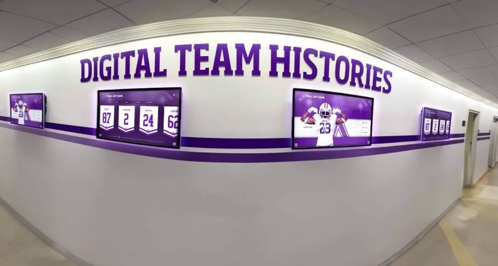
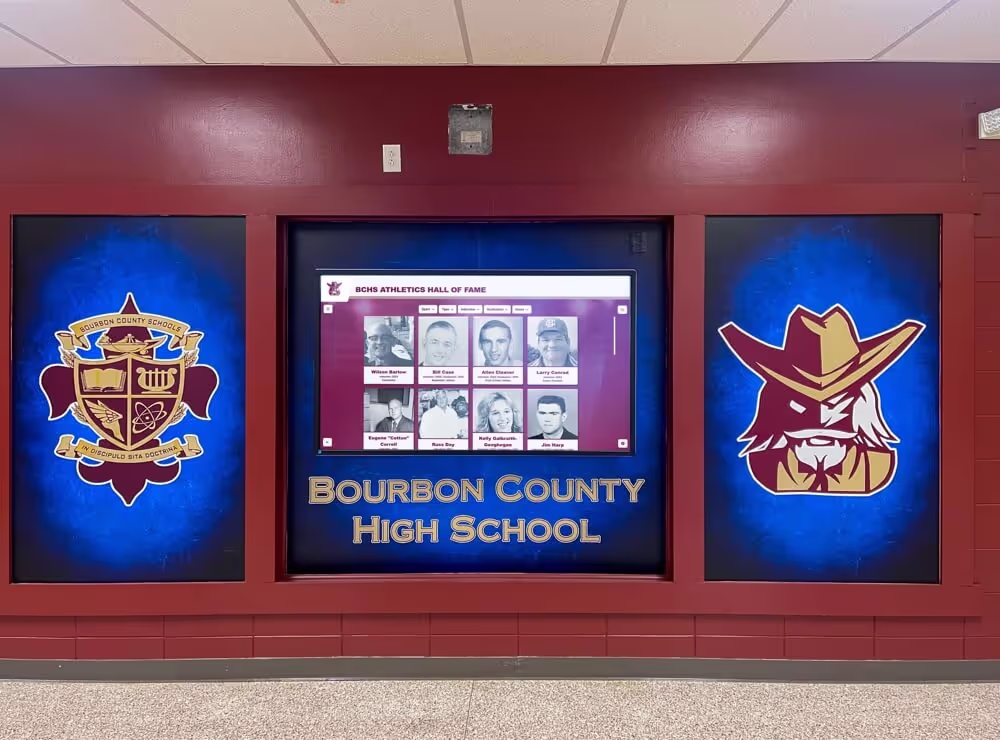
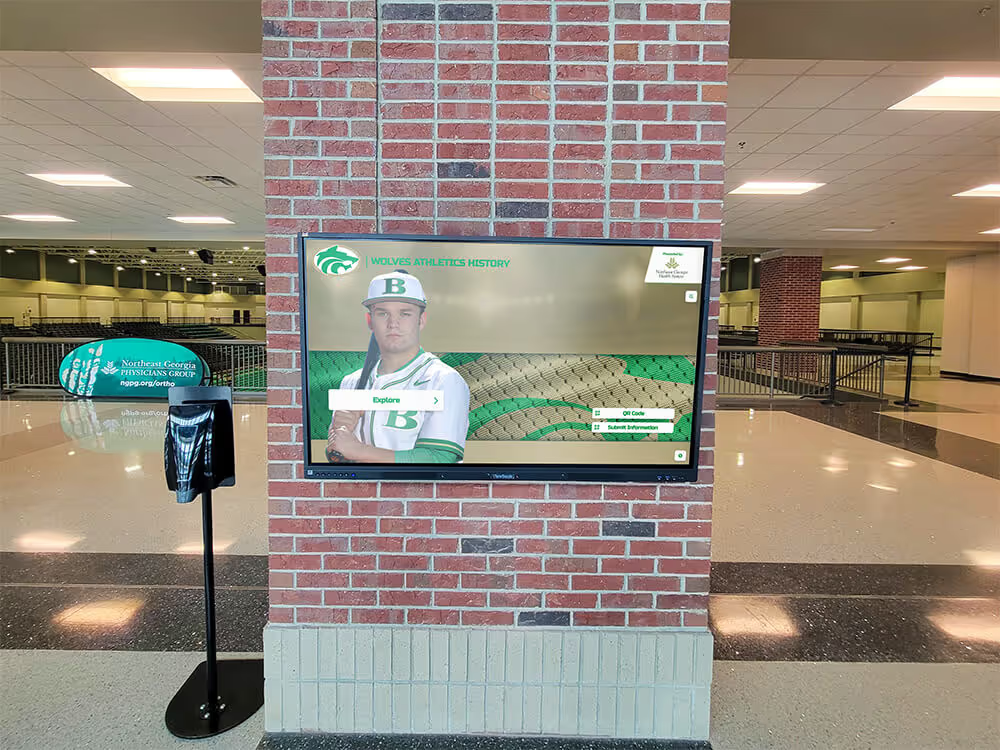
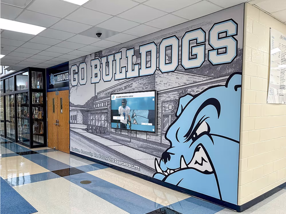
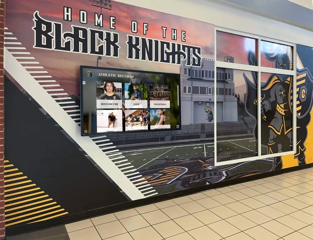
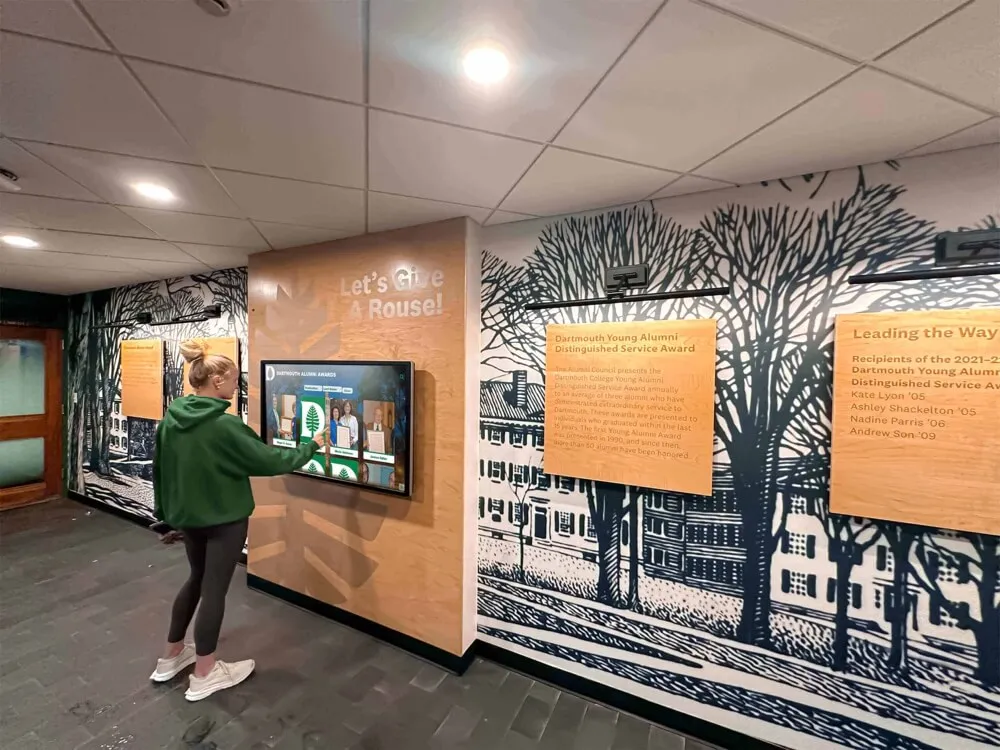
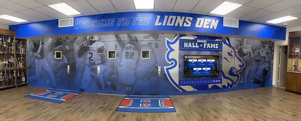
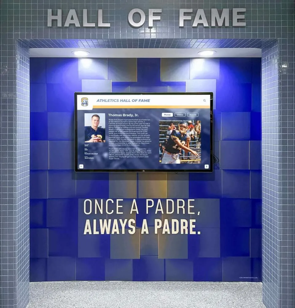
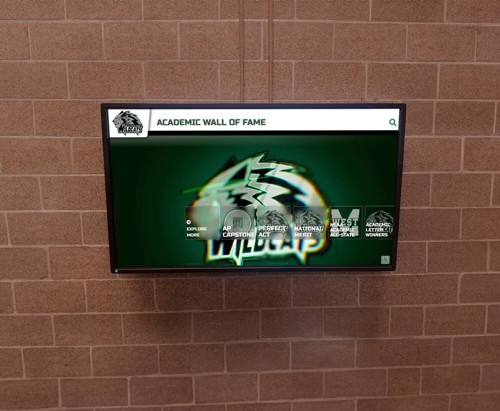
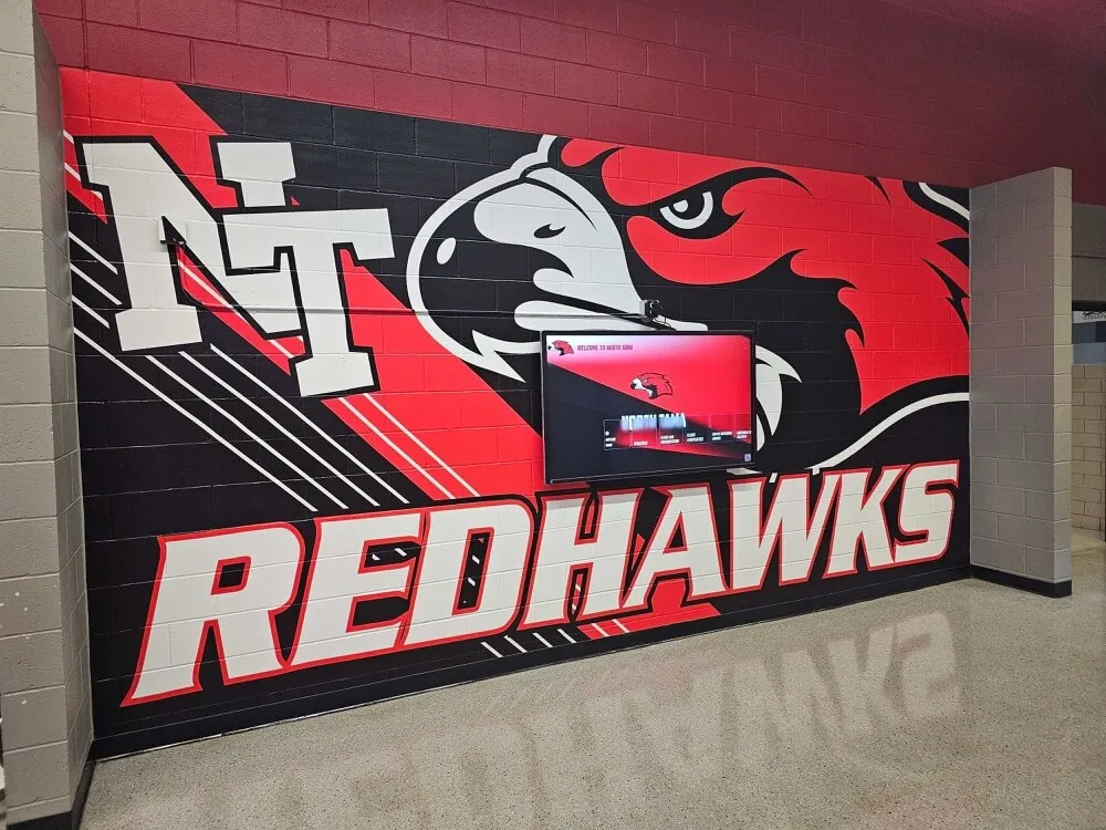
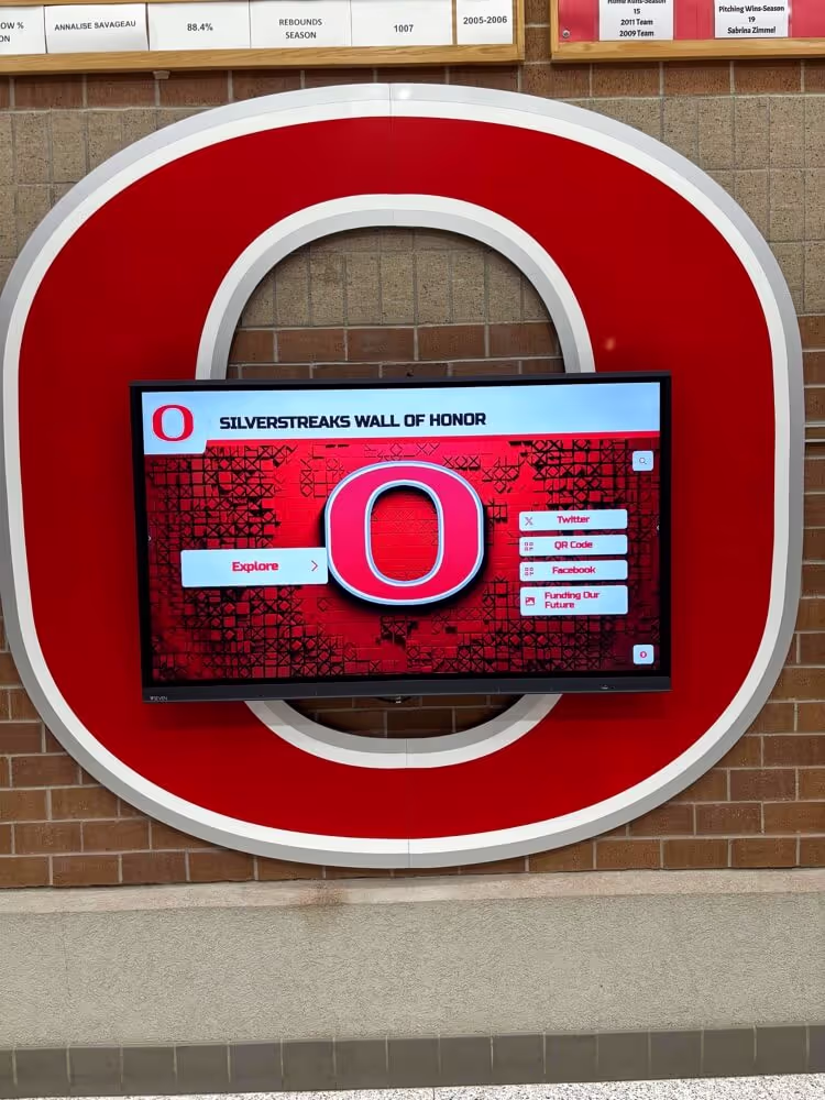
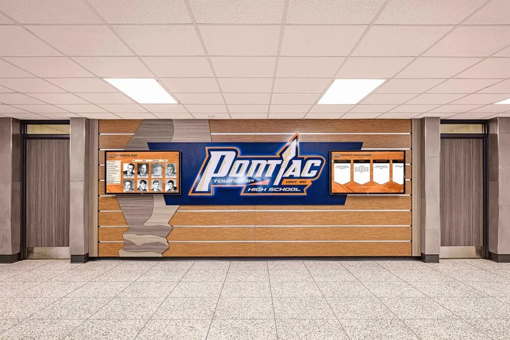
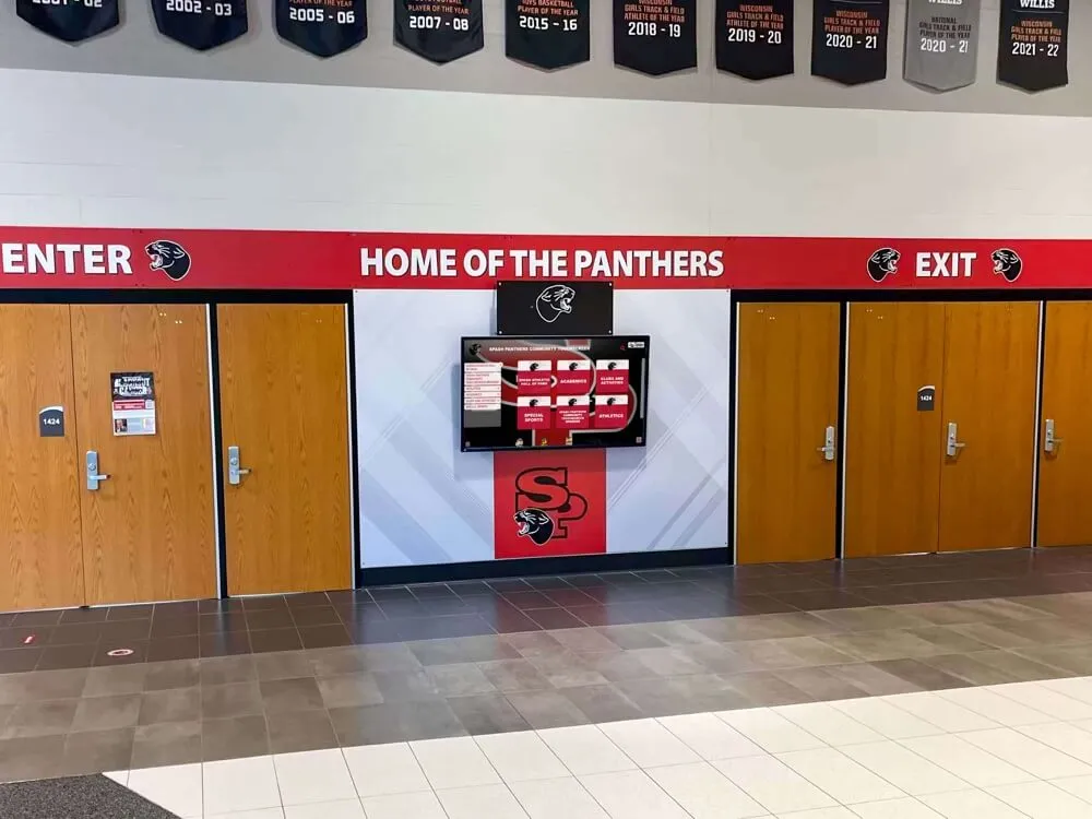
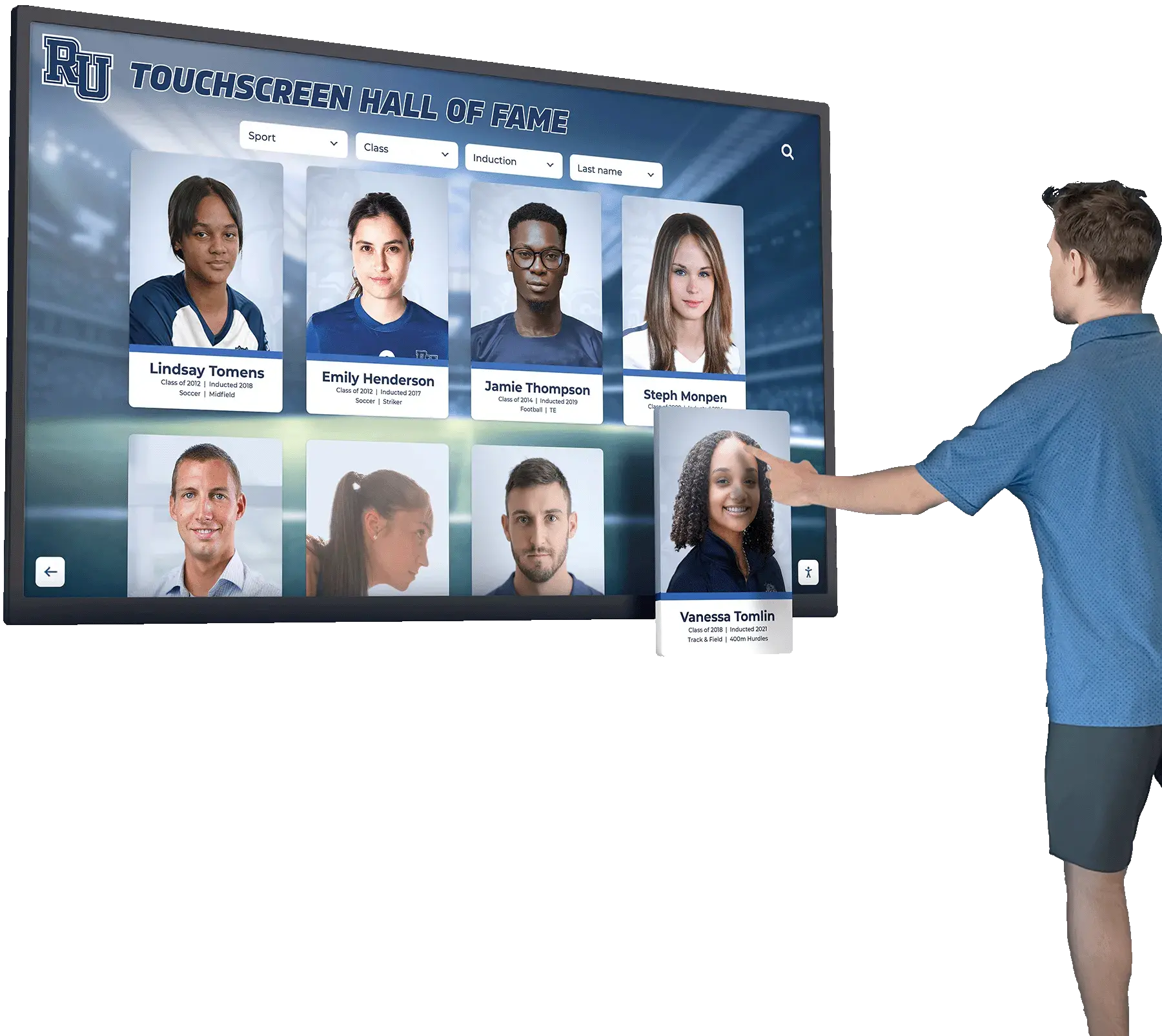
Rocket Alumni Solutions
Rocket Alumni Solutions provides turnkey touchscreen kiosk software with built-in zoom prevention optimized for recognition displays, halls of fame, and interactive exhibits. Their platform handles all technical complexities while providing:
- Automatic zoom prevention across devices
- Optimized touch interactions
- Professional content management
- Hardware compatibility testing
- Ongoing support and updates
Web-Based Kiosk Frameworks
If building custom solutions, frameworks like:
- Electron: For standalone kiosk applications
- Progressive Web Apps (PWAs): For web-based kiosks
- React/Vue/Angular: For interactive SPAs
All benefit from the zoom prevention techniques covered in this guide.
Hybrid Approaches
Many deployments combine platform features with custom code:
// Check if running in kiosk mode
if (window.kioskMode || window.matchMedia('(display-mode: standalone)').matches) {
  // Apply additional zoom prevention
  initializeKioskTouchControls();
}
Troubleshooting Common Problems
Even with proper implementation, issues can arise.
Problem: Zoom Still Works Despite All Methods
Potential Causes:
- Browser not respecting viewport meta tag
- JavaScript not loading properly
- CSS being overridden by other stylesheets
- Kiosk browser with non-standard behaviors
Solution:
// Force viewport settings programmatically
function forceViewportSettings() {
  let viewport = document.querySelector('meta[name="viewport"]');
  if (!viewport) {
    viewport = document.createElement('meta');
    viewport.name = 'viewport';
    document.head.appendChild(viewport);
  }
  viewport.content = 'width=device-width, initial-scale=1.0, maximum-scale=1.0, user-scalable=no';
}

// Run on load and periodically check
forceViewportSettings();
setInterval(forceViewportSettings, 5000);
Problem: Scrolling Doesn’t Work
Cause: Too restrictive touch-action settings
Solution:
/* Change from */
* { touch-action: none; }

/* To */
* { touch-action: pan-x pan-y; }
Problem: Buttons Not Responding
Cause: Event handlers preventing all touch events
Solution:
document.addEventListener('touchmove', function(event) {
  // Only prevent if actually zooming
  if (event.touches.length > 1 || event.scale !== 1) {
    event.preventDefault();
  }
  // Single touch events pass through
}, { passive: false });
Problem: Performance Degradation
Cause: Non-passive event listeners blocking scroll
Solution: Use passive listeners where possible:
// For monitoring only (no preventDefault needed)
document.addEventListener('touchstart', handler, { passive: true });

// Only use passive:false when necessary
document.addEventListener('touchmove', preventZoom, { passive: false });
Real-World Implementation Examples
Let’s look at complete examples for common kiosk scenarios.
Example 1: Simple Information Kiosk
<!DOCTYPE html>
<html lang="en">
<head>
  <meta charset="UTF-8">
  <meta name="viewport" content="width=device-width, initial-scale=1.0, maximum-scale=1.0, user-scalable=no">
  <title>Information Kiosk</title>
  <style>
    * {
      touch-action: pan-y;
      -webkit-user-select: none;
      user-select: none;
    }

    body {
      font-size: 20px;
      line-height: 1.6;
      margin: 0;
      padding: 20px;
      font-family: Arial, sans-serif;
    }

    button {
      min-width: 120px;
      min-height: 60px;
      font-size: 18px;
      margin: 10px;
    }
  </style>
</head>
<body>
  <h1>Welcome to Our Facility</h1>
  <p>Select an option to learn more:</p>
  <button>Directory</button>
  <button>Hours</button>
  <button>Events</button>

  <script>
    (function() {
      document.addEventListener('touchmove', function(e) {
        if (e.scale !== 1) e.preventDefault();
      }, { passive: false });

      ['gesturestart', 'gesturechange', 'gestureend'].forEach(evt => {
        document.addEventListener(evt, e => e.preventDefault());
      });
    })();
  </script>
</body>
</html>
Example 2: Interactive Gallery Kiosk
<!DOCTYPE html>
<html lang="en">
<head>
  <meta charset="UTF-8">
  <meta name="viewport" content="width=device-width, initial-scale=1.0, maximum-scale=1.0, user-scalable=no">
  <title>Gallery Kiosk</title>
  <style>
    * {
      box-sizing: border-box;
      touch-action: manipulation;
    }

    body {
      margin: 0;
      font-family: Arial, sans-serif;
      background: #000;
      color: #fff;
    }

    .gallery-container {
      touch-action: pan-x;
      overflow-x: auto;
      overflow-y: hidden;
      white-space: nowrap;
      padding: 20px;
    }

    .gallery-item {
      display: inline-block;
      width: 300px;
      height: 400px;
      margin-right: 20px;
      background: #333;
      cursor: pointer;
      touch-action: manipulation;
    }

    .gallery-item img {
      width: 100%;
      height: 100%;
      object-fit: cover;
    }
  </style>
</head>
<body>
  <h1 style="text-align: center; padding: 20px;">Art Gallery</h1>
  <div class="gallery-container">
    <div class="gallery-item"><img src="art1.jpg" alt="Artwork 1"></div>
    <div class="gallery-item"><img src="art2.jpg" alt="Artwork 2"></div>
    <div class="gallery-item"><img src="art3.jpg" alt="Artwork 3"></div>
  </div>

  <script>
    (function initGalleryKiosk() {
      // Prevent all zoom gestures
      document.addEventListener('touchmove', function(event) {
        if (event.scale !== 1) event.preventDefault();
      }, { passive: false });

      // Prevent double-tap zoom
      let lastTap = 0;
      document.addEventListener('touchend', function(event) {
        const now = Date.now();
        if (now - lastTap <= 300) {
          event.preventDefault();
        }
        lastTap = now;
      });

      // Handle artwork selection
      document.querySelectorAll('.gallery-item').forEach(function(item) {
        item.addEventListener('click', function() {
          console.log('Artwork selected:', this.querySelector('img').alt);
          // Handle selection logic
        });
      });
    })();
  </script>
</body>
</html>
Example 3: React-Based Kiosk Component
import React, { useEffect } from 'react';

const KioskApp = () => {
  useEffect(() => {
    // Prevent pinch-zoom
    const preventZoom = (e) => {
      if (e.scale !== 1) {
        e.preventDefault();
      }
    };

    // Prevent gesture events
    const preventGesture = (e) => {
      e.preventDefault();
    };

    // Prevent double-tap zoom
    let lastTouchEnd = 0;
    const preventDoubleTap = (e) => {
      const now = Date.now();
      if (now - lastTouchEnd <= 300) {
        e.preventDefault();
      }
      lastTouchEnd = now;
    };

    // Add event listeners
    document.addEventListener('touchmove', preventZoom, { passive: false });
    document.addEventListener('gesturestart', preventGesture);
    document.addEventListener('gesturechange', preventGesture);
    document.addEventListener('gestureend', preventGesture);
    document.addEventListener('touchend', preventDoubleTap);

    // Cleanup
    return () => {
      document.removeEventListener('touchmove', preventZoom);
      document.removeEventListener('gesturestart', preventGesture);
      document.removeEventListener('gesturechange', preventGesture);
      document.removeEventListener('gestureend', preventGesture);
      document.removeEventListener('touchend', preventDoubleTap);
    };
  }, []);

  return (
    <div style={{ touchAction: 'pan-x pan-y' }}>
      {/* Your kiosk content */}
      <h1>Welcome to Interactive Kiosk</h1>
      <button style={{ minWidth: '100px', minHeight: '60px' }}>
        Get Started
      </button>
    </div>
  );
};

export default KioskApp;
Security Considerations
Preventing zoom is one aspect of securing kiosk software, but comprehensive security requires additional measures.
Preventing Browser Escape
Combine zoom prevention with browser lockdown:
// Prevent right-click
document.addEventListener('contextmenu', e => e.preventDefault());

// Prevent common keyboard shortcuts
document.addEventListener('keydown', function(e) {
  // Prevent Ctrl+Plus/Minus (zoom)
  if (e.ctrlKey && (e.key === '+' || e.key === '-' || e.key === '0')) {
    e.preventDefault();
  }
  // Prevent F11 (fullscreen toggle)
  if (e.key === 'F11') {
    e.preventDefault();
  }
  // Prevent Alt+F4 (close window)
  if (e.altKey && e.key === 'F4') {
    e.preventDefault();
  }
});
Content Security Policy
Implement CSP headers to prevent code injection:
<meta http-equiv="Content-Security-Policy"
      content="default-src 'self';
               script-src 'self' 'unsafe-inline';
               style-src 'self' 'unsafe-inline';">
Kiosk Mode Browsers
Professional kiosk deployments often use dedicated browsers:
- Windows: Use kiosk mode in Edge or Chrome with policy restrictions
- Android: Use Android Kiosk Mode or MDM solutions
- iOS: Use Guided Access or MDM profiles
- Linux: Use kiosk-specific browsers like Porteus Kiosk
Conclusion: Implementing Robust Zoom Prevention
Disabling pinch-to-zoom for touchscreen kiosks requires a multi-layered approach combining HTML viewport configuration, CSS touch-action properties, and JavaScript event prevention. The most effective implementation uses all three methods to ensure compatibility across devices and browsers.
Quick Implementation Checklist
✅ Add viewport meta tag with user-scalable=no
✅ Implement CSS touch-action: pan-x pan-y globally
✅ Add JavaScript touchmove event prevention with passive: false
✅ Prevent iOS gesture events (gesturestart, gesturechange, gestureend)
✅ Implement double-tap zoom prevention
✅ Test on actual target devices
✅ Verify scrolling still works properly
✅ Ensure accessibility with large fonts and touch targets
When to Use Professional Kiosk Software
While the techniques in this guide work for custom implementations, professional kiosk software platforms like Rocket Alumni Solutions provide tested, optimized zoom prevention along with comprehensive kiosk features including:
- Pre-configured touch behaviors
- Hardware compatibility testing
- Ongoing security updates
- Professional support
- Content management systems
- Analytics and monitoring
For organizations deploying multiple kiosks or requiring enterprise-grade reliability, professional platforms eliminate technical complexity while providing proven solutions.
Further Resources
For more information about touchscreen kiosk development and deployment:
- Kiosk Interactive Software Features Guide
- Touchscreen Software Security Best Practices
- Complete Touchscreen Kiosk Software Buying Guide
Whether you’re building custom kiosk applications or configuring existing platforms, properly disabling pinch-to-zoom creates a more professional, controlled user experience that prevents frustration and reduces the need for staff intervention.