Designing a yearbook is one of the most demanding creative projects a student editor will take on. Every spread carries a different purpose — portraits, athletics, clubs, academics, senior features — yet the finished book has to feel like a single coherent document. That coherence starts with layout. When your page grids are consistent, your typography intentional, and your section templates defined before the first photo drops in, the staff works faster, the book looks more professional, and the people who appear in it feel genuinely honored rather than squeezed onto a crowded page.
This guide walks through yearbook page layouts section by section, giving editors a practical template framework they can adapt to any theme, school size, or publication timeline. Whether you are rebuilding your layout system from scratch or refining a structure that already exists, the principles and templates here apply directly to every part of the book.
Most yearbook editors inherit some version of a layout system from the year before. Some of it works. Some of it creates problems every production cycle. The challenge is knowing which elements to keep, which to fix, and how to build templates that support rather than constrain your staff’s creativity. That process begins with understanding why page layout decisions matter beyond aesthetics.

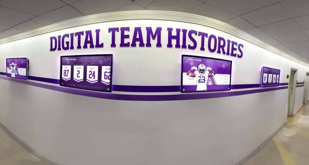
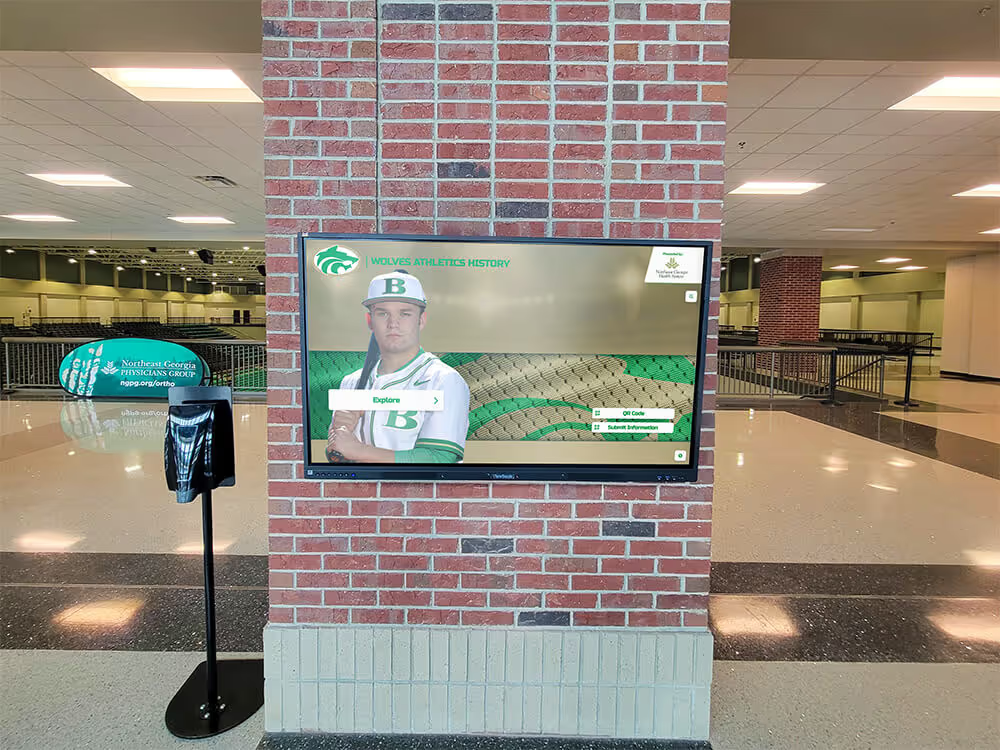
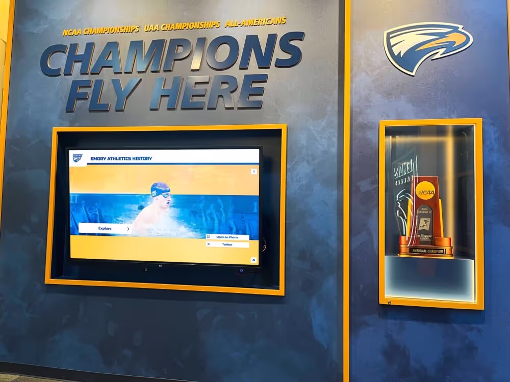
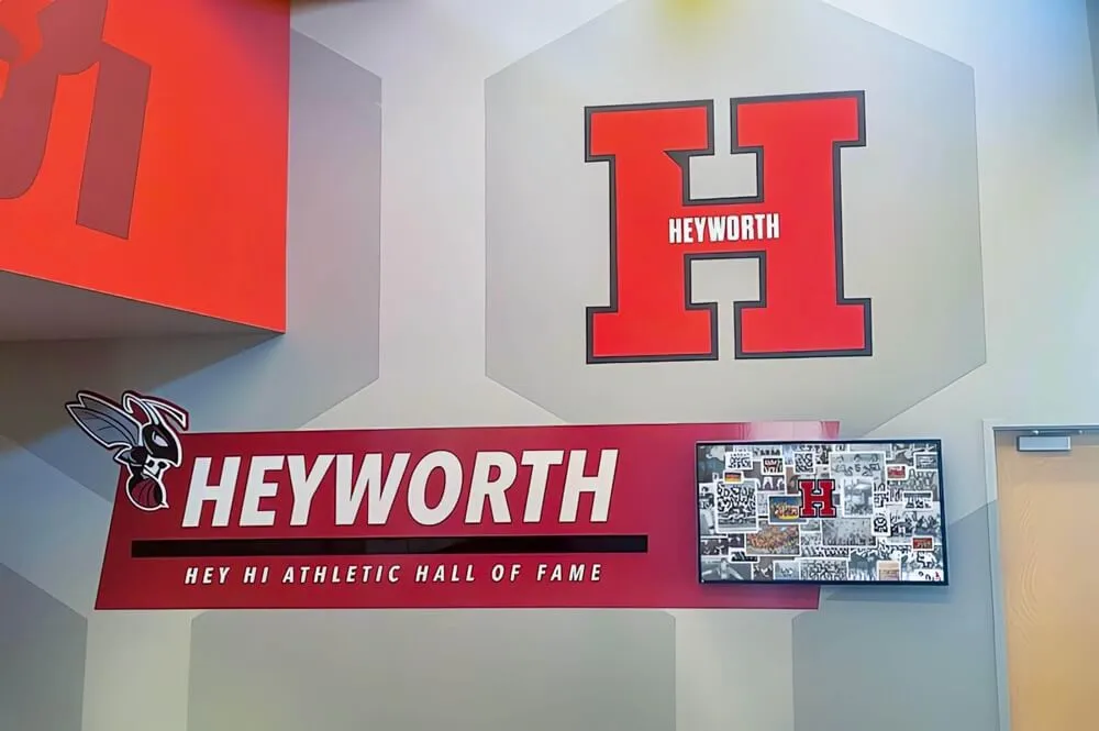
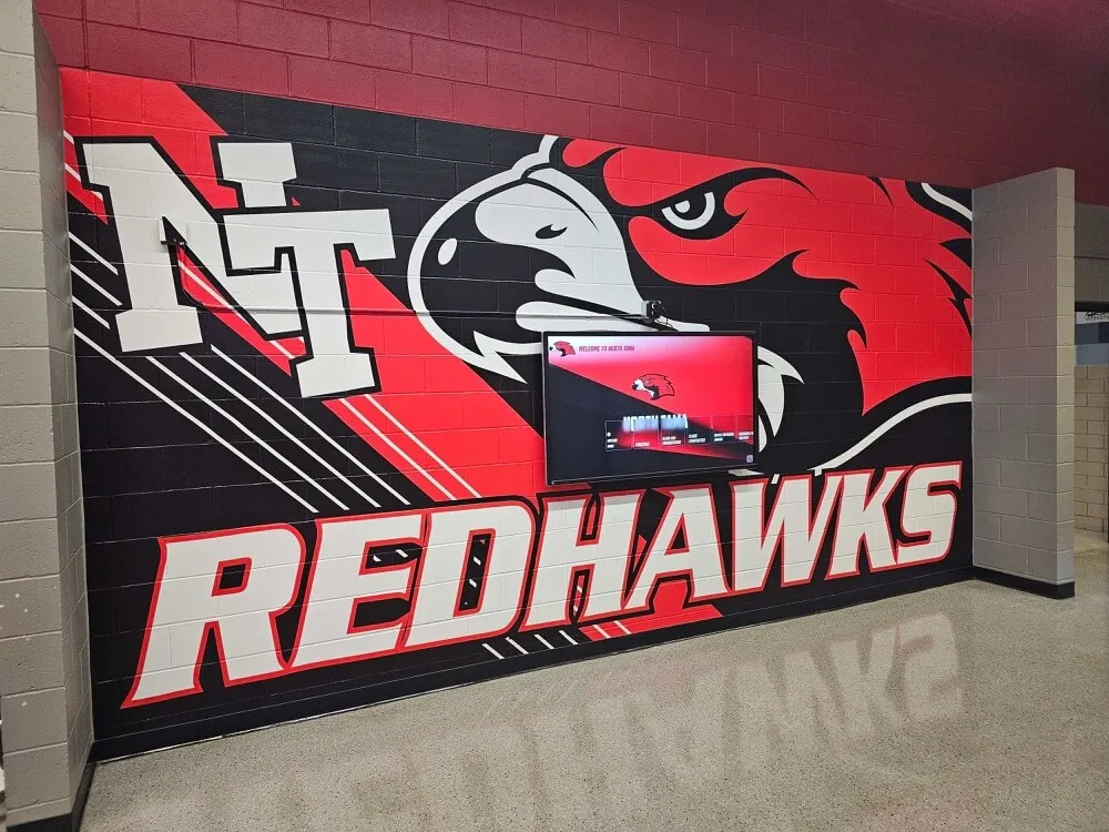
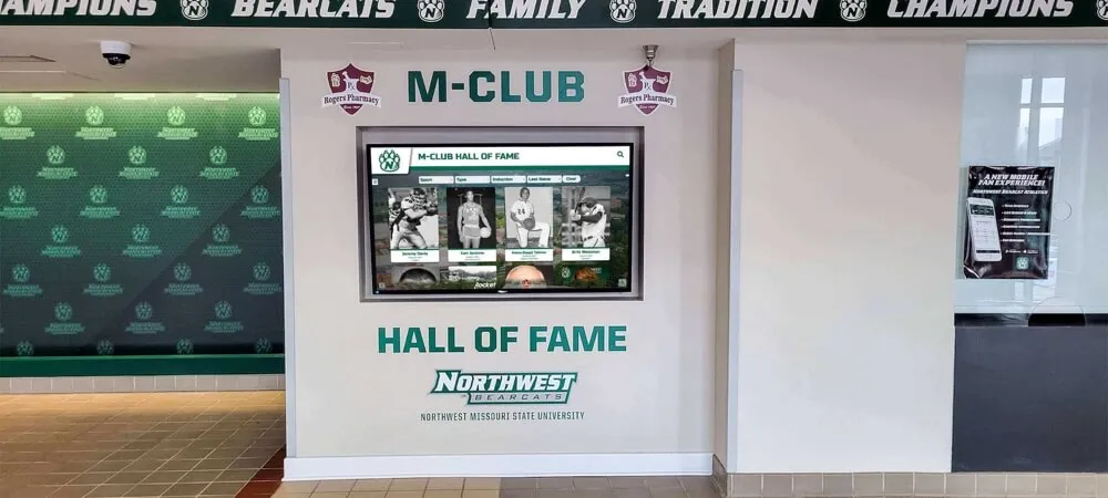
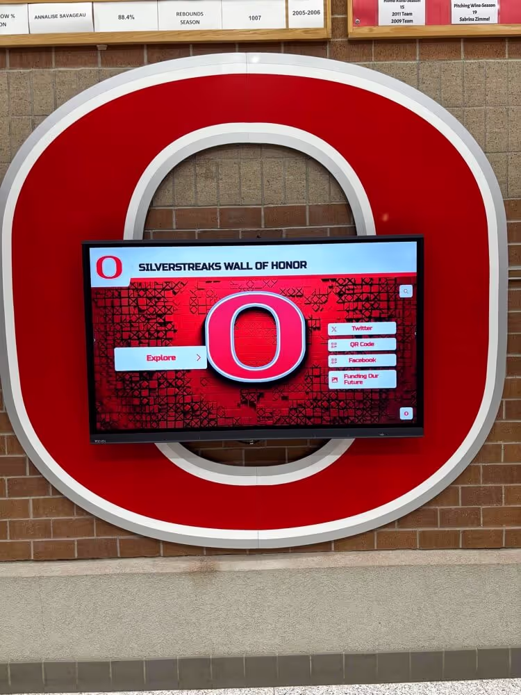
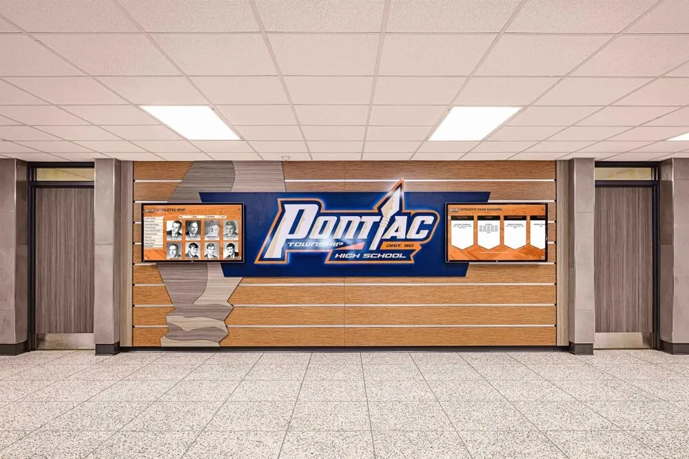
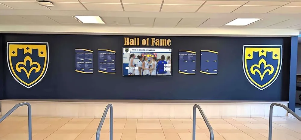
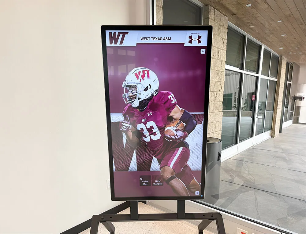
Structured grid systems — like those used in digital recognition displays — give editors a repeatable framework for placing portraits, text, and graphics consistently across every spread
Why Yearbook Page Layouts Drive Everything Else
Layout is the invisible infrastructure of a yearbook. When it works well, readers flip through the book without thinking about design — they simply enjoy the content. When it fails, they sense something is off even if they cannot name it: photos feel cramped, captions seem disconnected from images, section openers look like ordinary pages, and the whole book lacks the visual hierarchy that makes printed publications satisfying to read.
A layout system does four things for your staff:
It creates efficiency. Templates with locked grid positions mean page designers are not reinventing placement for every spread. A staff member working on the sophomore portrait section does not need to decide how far from the gutter a caption should sit — the template decides that, freeing creative energy for the work that actually benefits from decisions.
It enforces consistency. Readers register inconsistency subconsciously. When margins vary by a few points, or when one section uses 9pt caption text while another uses 11pt, the book feels unfinished even if individual spreads look good in isolation. Templates hold standards across dozens of designers working at different skill levels.
It supports theme extension. A strong yearbook theme should move through the book, not just appear on the cover and opener. Page layout templates carry theme elements — graphic shapes, color pockets, typography choices — into every section automatically, so theme expression does not depend on individual designers remembering to apply it.
It simplifies coverage decisions. When editors know exactly how many photos fit on a standard club page or what a three-column athletics spread holds, they can assign coverage targets precisely rather than guessing how much content each section needs.
Schools that build comprehensive archives of student life — from yearbooks to athletic records to honor rolls — understand the long-term value of consistent visual documentation. Explore how academic history archiving for schools creates a permanent institutional record that serves students and communities for decades.
Grid Systems: The Foundation of Every Layout
Before building section templates, establish your grid. Every design decision — column widths, photo sizes, margin positions — derives from the grid. Most yearbook software works on some version of a modular grid, and understanding grid terminology prevents the inconsistencies that come from eyeballing placement.
Selecting Your Page Grid
Standard yearbook page size is 8.5 × 11 inches, though some publishers offer 9 × 12 formats. Work within your publisher’s actual trim dimensions, not assumed ones.
Margin structure defines where content lives. Common setups:
| Margin | Typical Range | Notes |
|---|---|---|
| Outside (fore-edge) | 0.375"–0.5" | Wider gives lighter feel |
| Inside (gutter) | 0.5"–0.75" | Account for binding loss |
| Top (head) | 0.375"–0.5" | Consistent across sections |
| Bottom (foot) | 0.5"–0.625" | Folio line lives here |
Column count shapes how flexible each section feels. A six-column grid gives the most versatility — columns can combine into two-column photo blocks, three-column text runs, or six-column full-bleed images — while maintaining consistency across section types.
Baseline grid aligns text across columns. Set your baseline to match your body text leading (for example, 10pt text on 13pt leading uses a 13pt baseline grid). Every text frame snaps to this grid so columns align across the spread.
Gutter width between columns controls visual breathing room. Narrow gutters (0.125") suit dense portrait sections; wider gutters (0.25"–0.375") work better for feature spreads where white space is intentional.
The Spread as Your Design Unit
Yearbooks are read in spreads, not individual pages. Design and evaluate every layout as a two-page unit. This affects:
- Photo placement: Large anchoring images should span or visually bridge the gutter when the content warrants it
- Visual flow: The eye typically enters at the top-left of a spread, moves right, and needs a clear path through the content
- Balance: Optical weight should distribute across both pages — a heavy photo on the left needs a strong graphic element on the right, not empty space
Section-by-Section Layout Templates
Different sections of a yearbook serve different purposes, and their layouts should reflect that. Here is a template framework for each major section.
Opening Spread Template
The opening spread sets tone for the entire book. It introduces the theme, establishes the visual language, and should be the most designed spread in the yearbook. This is not a content spread — it is a declaration.
Template characteristics:
- Theme typography dominates at least 40% of the spread area
- Year and school name prominent and legible from reading distance
- One strong hero image (full bleed or near-full bleed) anchors the spread
- No more than three separate graphic elements compete for attention
- Color palette locks in here — every subsequent section references this spread
What to avoid: Cramming in content (quotes, stats, thumbnails) that belongs in later sections. The opener is visual, not informational.
Grid application: For a full-bleed opener, the image lives outside all margins and the type layers on top using generous clear space around letterforms. For a frame-style opener, work within a defined content area with a consistent inner border the theme graphic fills.
Portrait and Class Pages
Portrait pages are the highest-stakes layout in any yearbook — the section most students turn to first, and the one where errors feel most personal. Your portrait template needs to balance efficiency (fitting the required number of portraits) with dignity (making sure each student looks genuinely honored rather than compressed).
Portrait sizing depends on your section’s enrollment count. For sections of fewer than 100 students, you can afford larger portrait crops. Larger sections require smaller portraits, but maintain a minimum that keeps faces clearly recognizable. A common benchmark: portrait cells should be no smaller than 1" × 1.25" at print size.
Grid for portraits:
| Students per spread | Columns | Rows | Portrait size |
|---|---|---|---|
| Up to 24 | 4 | 6 | ~1.5" × 2" |
| 25–40 | 5 | 8 | ~1.25" × 1.6" |
| 41–60 | 6 | 10 | ~1.1" × 1.4" |
| 61+ | 7–8 | 10–12 | Minimum legible |
Name line sits below each portrait, centered, in a legible sans-serif at 7–8pt. Never stack the name inside the portrait crop — it obscures the face.
Section identifier (class year, grade, or alpha range covered) appears in a consistent position, typically upper outer corner or lower inner margin of each spread.
Decorative space: Reserve one or two cells per spread for a small section graphic, a theme element, or an ad break if your publication carries advertising. Never leave these cells accidentally empty — plan them intentionally.

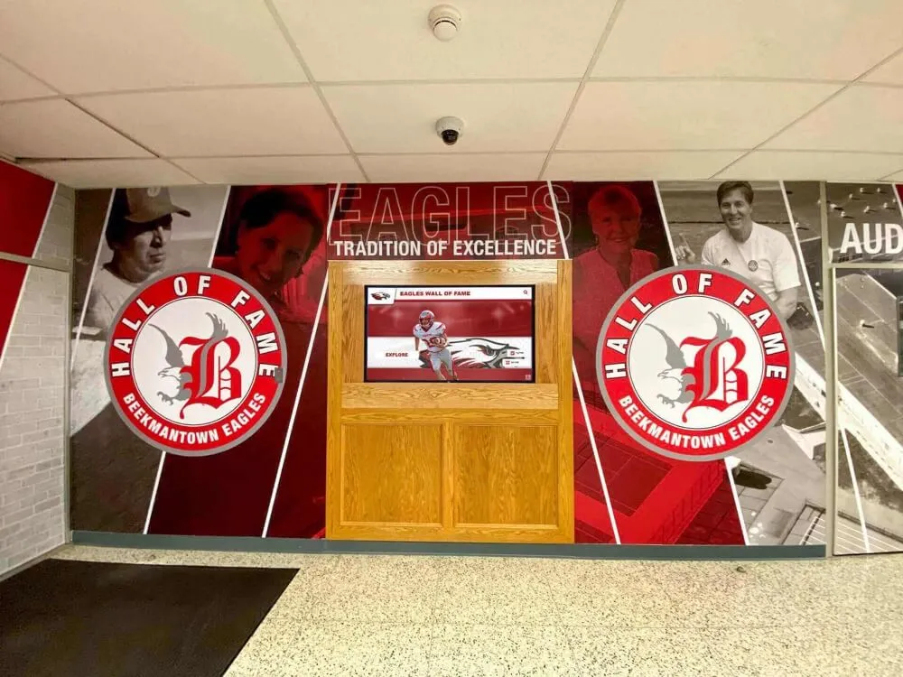
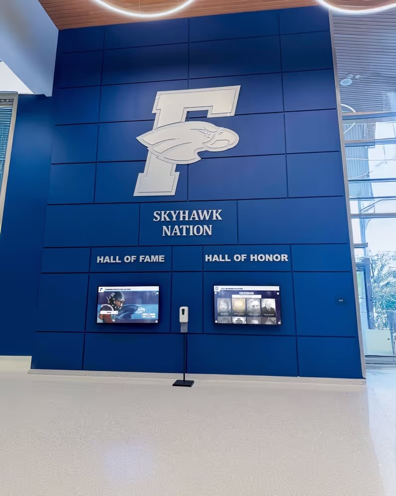
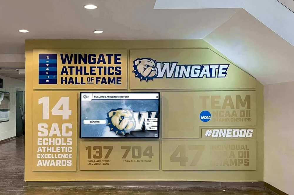
Consistent portrait grids — whether in print yearbooks or digital recognition displays — create the visual order that makes individual faces feel properly honored
Senior Section Templates
The senior section typically receives more design freedom and more pages than any other class. Seniors expect to feel distinguished from underclassmen, and the layout should deliver that.
Senior portrait template differs from underclassman portrait pages in several ways:
- Larger individual portrait sizes (many publications use 2" × 2.5" or larger)
- Space for senior quote beneath each portrait
- Option for full-name display rather than first initial/last name only
- Consistent visual treatment that sets this section apart (different background treatment, heavier weight dividers, or accent colors)
Senior feature spreads require their own templates. Common feature types:
Senior superlatives spread: Two-column text list with small portrait insets. Lock the column structure and portrait size so staff can drop in content without rebuilding layouts. Each award category gets equal visual weight.
Senior class statistics spread: Infographic-style layout using your six-column grid. Charts, callout numbers, and brief text blocks combine on a single spread. Limit to data the class actually provided — no invented statistics.
Senior reflection spread: Collage or timeline format featuring candid photos across all four years. Photo sizes vary more than in portrait sections, but maintain a consistent margin and gutter treatment throughout.
Senior dedication pages: Some publications offer paid senior ad pages. Use a consistent template with defined zones for parent photo, student photo, and message text so the section feels coherent even though families control the content. See how graduation slideshow templates approach a similar challenge of maintaining visual consistency across personalized content.
Academics and Clubs Section
Club and organization pages balance group photography, captions, and roster information within a limited spread count. The challenge is that group sizes vary enormously — a chess club might have seven members while the marching band has 120.
Scalable club template approach: Rather than building one template, build a flexible system with three variants:
Small club template (under 20 members): One large group photo, full member roster, officer listing, and brief description text. Group photo takes 50–60% of the spread area.
Medium club template (20–60 members): Primary group photo plus two or three activity photos. Roster runs in two columns at a smaller point size. Activity photos show the club in action rather than posed.
Large organization template (60+ members): Multiple activity photos dominate; roster may be listed in a separate index rather than on the spread. Identifier graphics (logo, banner) ground the section visually.
Consistent elements across all club templates:
- Organization name in a defined position at a defined size (do not let titles float)
- Advisor credit in consistent position and type style
- Caption rule: every photo gets a caption; no orphan images
- Year active or founded, if available, in secondary type
Supporting student organizations through recognition connects to broader school culture. Digital displays that feature club achievements year-round — like end-of-semester honor roll and academic recognition displays — complement what the yearbook documents annually.

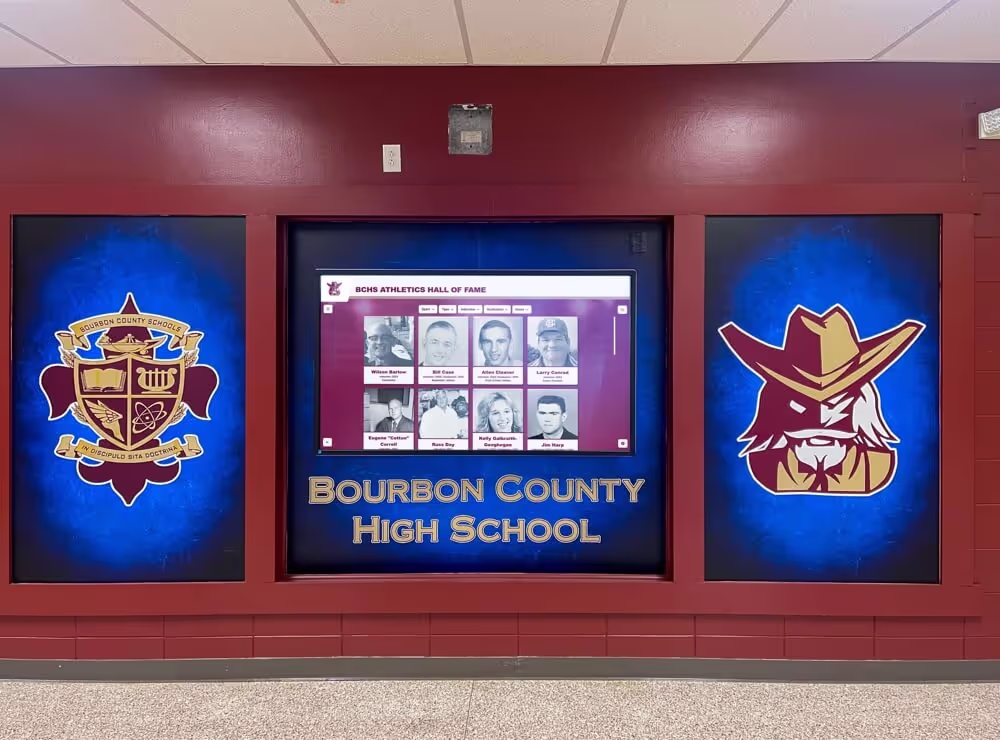
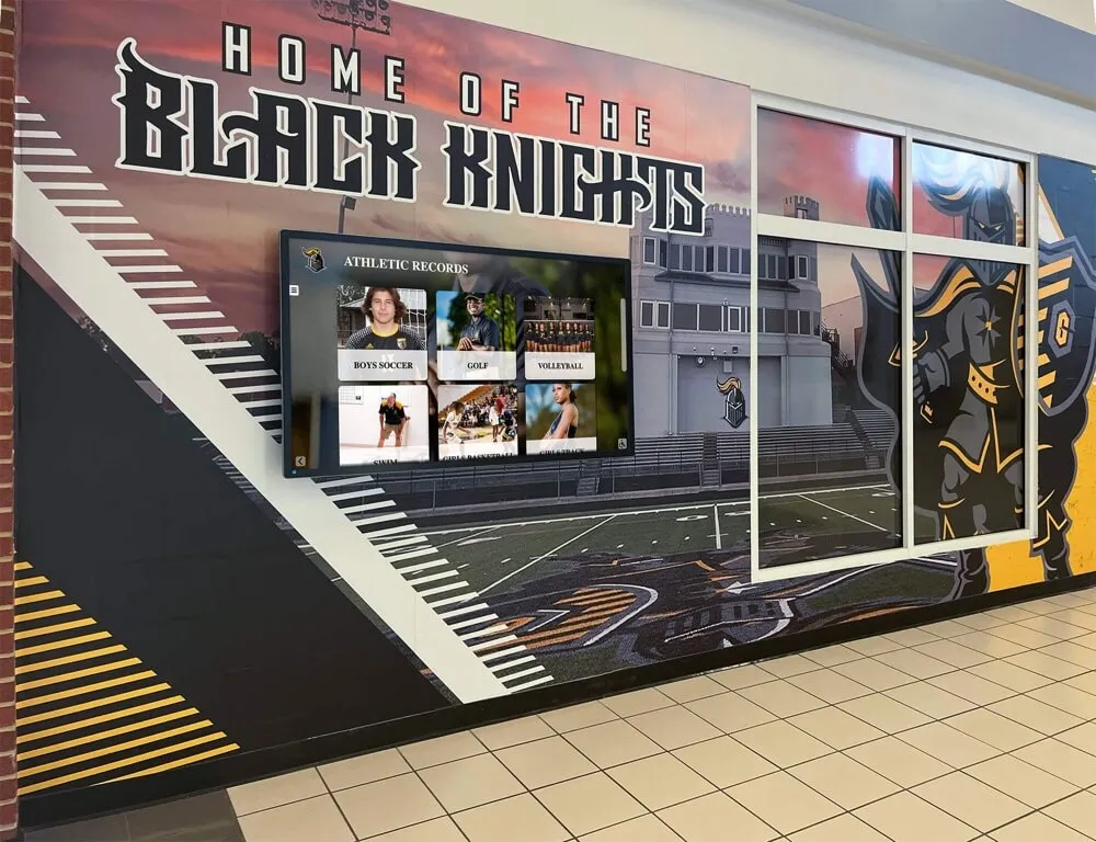
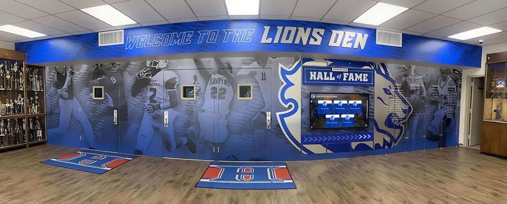
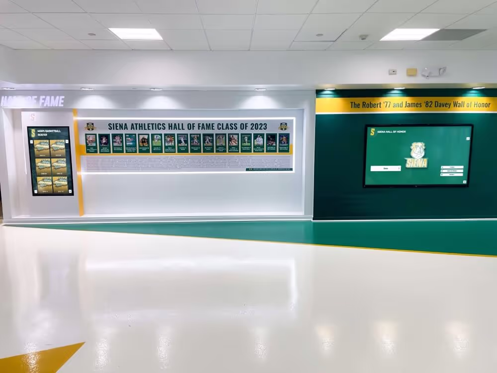
Schools that document their clubs and teams both in print yearbooks and on-campus digital displays create layered recognition systems that serve students and alumni simultaneously
Athletics Section Templates
Athletic section layouts have to handle high-energy photography, varsity through JV roster variations, season record information, and typically more visual real estate than other sections because sports photography is the most dramatic content in most yearbooks.
Sport opener spread: Each sport within the athletics section benefits from its own mini-opener. One full-spread or near-full-spread action photo, sport name in theme typography, and a brief season summary in no more than three sentences. This spread does not carry portrait content — it establishes the visual energy of the section.
Roster/action spread: Follows the opener and combines the team portrait (or individual portraits) with action photography and season records.
Template for a standard varsity sport spread:
- Anchor photo (action): 40–50% of spread
- Individual portraits or team photo: 25–35% of spread
- Season record block: locked position, defined size
- Caption zone: consistent beneath each photo
- Stat callout (optional): one standout statistic in large display type
Multi-sport pages: Some publications combine JV and lower-level sports onto shared pages. Build a template that treats each team equally — equal portrait sizes, equal caption space, equal record display — even when sports vary in team size.
State and championship recognition: If your school earned a title or placed at the state level, give that moment a dedicated spread rather than absorbing it into the standard template. Championship spreads earn the visual exception.
Schools with strong athletic programs often extend this recognition beyond the yearbook. Explore how state championships displays honor athletic achievements in permanent campus installations.
Faculty and Staff Section
Faculty pages are frequently underpowered in high school yearbooks. Staff members are documented with a portrait and a name, and that is the end of their recognition. A stronger template approach treats faculty with the same care as senior portraits.
Standard faculty template:
- Portrait: consistent crop, consistent size (slightly larger than student portraits conveys status appropriately)
- Name and title: two-line treatment, clearly legible
- Department grouping: faculty sorted and visually grouped by department rather than alphabetical across the entire school
Featured faculty spread: One spread per book that profiles three to five faculty members with extended candid photography and brief quotes or fun facts. This spread uses a looser grid than the standard portrait template — more white space, larger images, display type callouts. Use the same spread layout every year so the tradition becomes part of your school’s yearbook identity.
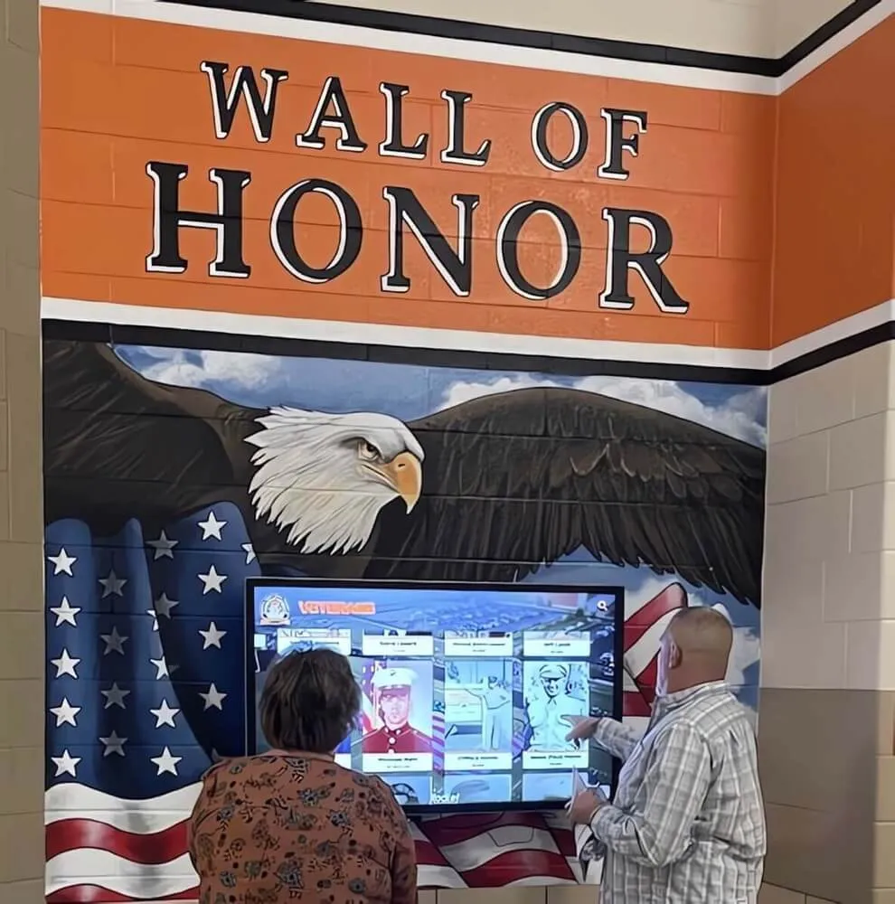
Staff recognition integration: Many schools now connect print recognition to digital displays. The hall of fame induction ceremony planning guide covers how schools build multi-year faculty recognition programs that sit alongside print documentation.
Closing Spread and Index
The closing spread and index are often treated as afterthoughts. They should not be.
Closing spread template: Mirror the energy of your opener — not the same content, but the same visual weight. Options include a final candid collage, a year-in-review timeline, or a typographic close that reflects on the theme. Whatever the format, the template should be defined before production begins so designers know they are building toward this landing point.
Index layout: The index is a functional page, but it still deserves consistent typographic treatment. Two or three columns, consistent leading, bold last names for scan-ability, and page number formatting that matches your folio style throughout. A well-formatted index signals professionalism.
Colophon block: Document your production specs — software used, print specifications, staff list, advisor name, and printer information — in a defined block within the closing section. Keep this template identical year to year. Future advisors and archives researchers will thank you.
Typography Rules by Section
Typography is the easiest place to let consistency slip, and the most visible sign of an inconsistent book. Build your type system before creating any templates.
Establish four type roles:
| Role | Use | Example treatment |
|---|---|---|
| Display | Section titles, theme text | Serif or script at 36–72pt |
| Header | Spread headlines, sport names | Bold sans-serif at 18–28pt |
| Body | Story text, descriptions | Readable serif or sans at 9–10pt |
| Caption | Photo captions, name lines | Lighter weight sans at 7–8pt |
Apply these roles consistently. A section title on a club page should use the same display font and approximate size as a section title in athletics. Captions under portraits should use the same type treatment as captions under action photography.
Contrast is functional, not decorative. The difference between your display type and your body type should be large enough that readers never mistake one for the other. If your display and header roles look similar, one of them is unnecessary.
Avoid type crimes that distract from content:
- Stretched or condensed letterforms (use a condensed font variant instead)
- Body text smaller than 8pt (legibility at print)
- More than two typeface families in a section
- Centered body text blocks longer than four lines
Color and Visual Theme Consistency
Your theme colors should appear on every spread, but not with equal intensity on every spread. Build a system that distinguishes section types through color weight.
Primary palette application:
- Full-intensity on section openers and feature spreads
- Reduced to accent use (divider lines, callout boxes, folio bars) on portrait and roster pages
- Neutral on heavy-content pages (index, colophon) where color would compete with information
Section color coding: Some publications assign a secondary accent color to each major section (athletics, academics, faculty). This aids navigation when readers flip through a physical book. If you use this approach, keep the section colors within your theme palette rather than introducing unrelated hues.
Photo color treatment: If your theme involves a tinted or duotone photo treatment, decide now which sections use that treatment and which use full-color photography. Applying it inconsistently undermines both the theme and the sections that skip it.
Layout Mistakes That Cost Production Time
These are the errors that appear in critique notes every production cycle and cost editors hours of rework.
Inconsistent gutter margins: When facing pages have different inside margins, the gutter looks misaligned even if both pages are individually correct. Lock inside margins to the same value and check them as part of template creation.
Floating elements: Any graphic element without an anchor to the grid — a callout box positioned by eye, a photo slightly outside the defined column — will drift across production. Every element should snap to your grid.
Unlinked text frames: Text overflow in an unlinked frame goes nowhere. Build portrait name lines and caption zones as linked text threads within your template so overflow is immediately visible rather than silently lost.
Photo resolution mismatches: Define a minimum resolution for each section (typically 200–300 dpi at print size for portraits; action photography tolerates slightly lower resolution due to crop flexibility). Build this into your photo submission guidelines, not as an afterthought review before press.
Inconsistent spread bleed application: If your template includes full-bleed elements, they need to extend 0.125" beyond the trim edge on every outer margin. Templates that do not include bleed marks or guides cause this to fail inconsistently.
Digital Integration: Extending Yearbook Layouts Beyond Print
Modern yearbook programs increasingly think beyond the print edition. Digital yearbook formats, supplemental online content, and school archive systems all benefit from layout thinking borrowed from print design.
The transition to digital high school yearbook platforms introduces new layout considerations: interactive elements, video embeds, search functionality, and responsive grid behavior across screen sizes. The underlying principles — consistent grids, defined type roles, section-specific templates — apply equally, but physical constraints (page size, bleed, resolution) give way to screen constraints (viewport width, touch targets, load time).
Schools that maintain long-term digital archives of yearbook content create resources that serve alumni engagement, institutional history research, and community connection for decades. The digitizing old yearbooks guide for hall of fame displays walks through how schools convert physical yearbook archives into searchable digital collections.
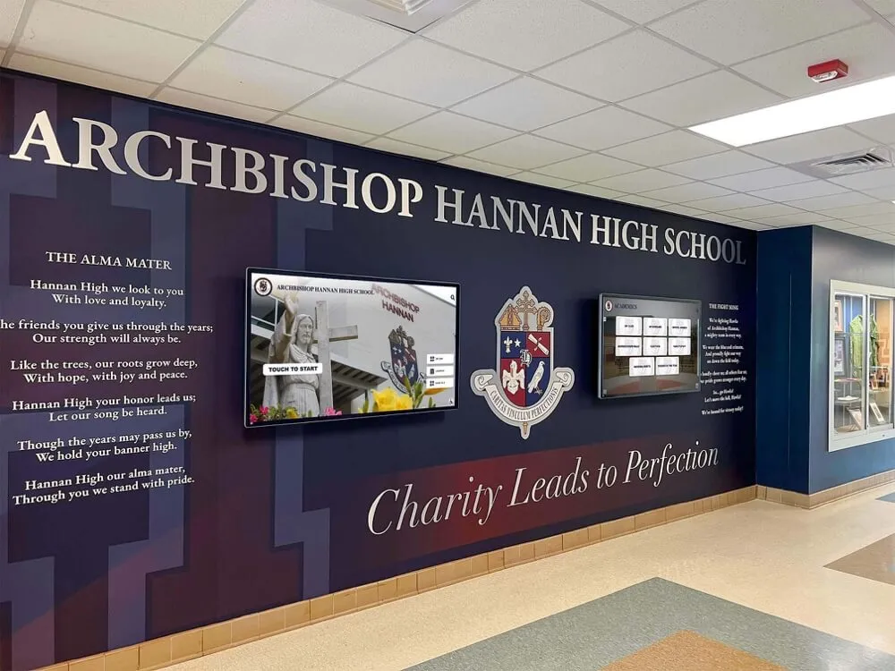
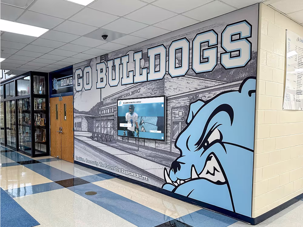
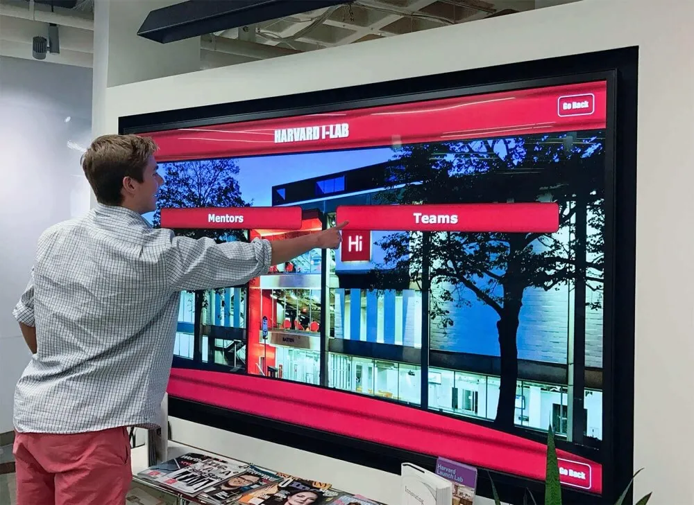
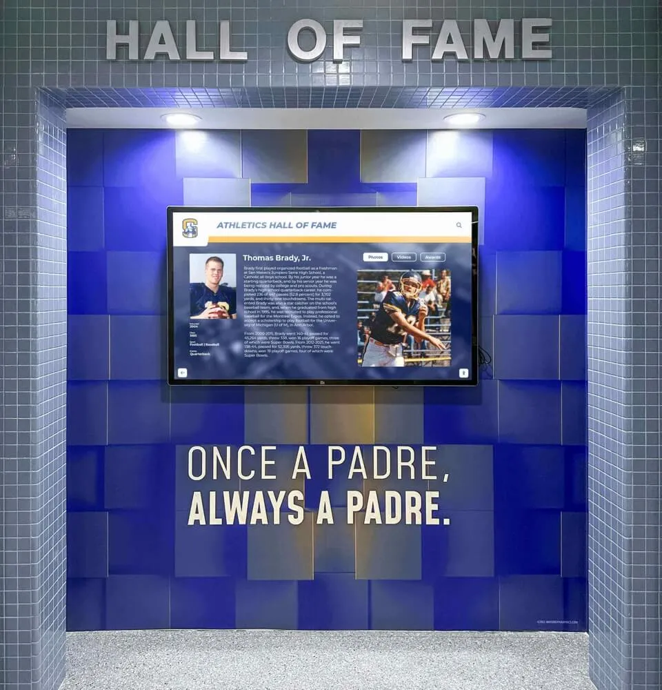
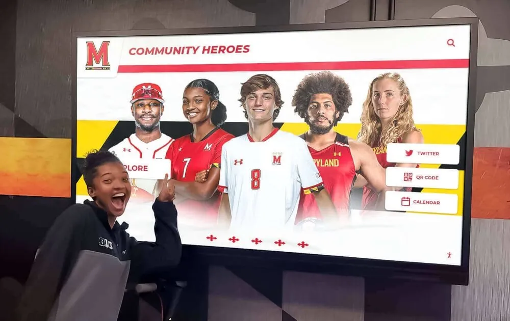
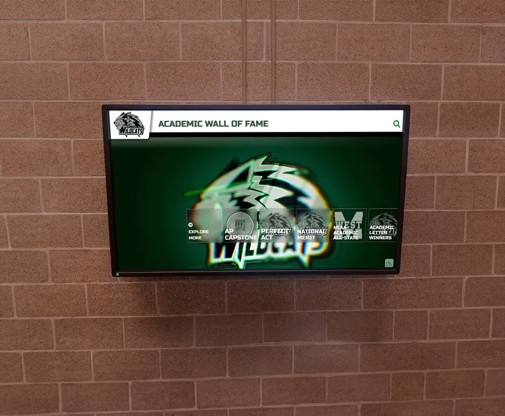
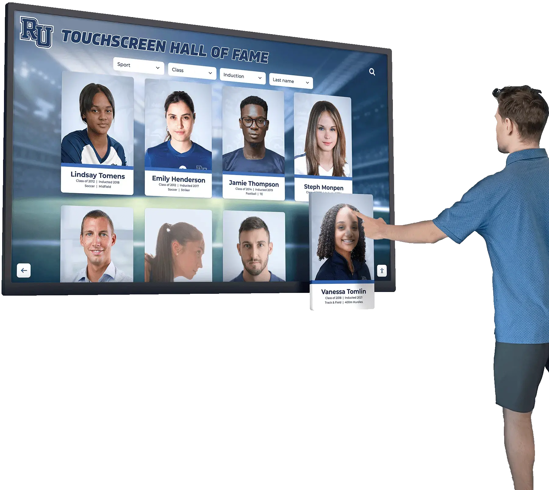
Touchscreen display integration: Some schools now display yearbook content — and extend it — on interactive lobby and hallway displays that feature student portraits, class histories, and recognition. These systems use grid-based profile layouts that mirror yearbook portrait pages, but allow unlimited content depth: clicking a portrait reveals athletic records, academic honors, and activity history that a printed page could never hold. Explore touchscreen augmented reality display capabilities for schools integrating interactive recognition into their facilities.
Graduation archives: Graduation content produced for the yearbook — candid photos, senior quotes, group shots — can be repurposed for graduation ceremony displays and alumni archives. Graduation slideshow ideas for senior tributes covers how the same content that appears in the yearbook translates into ceremony displays that families experience in real time.
Schools building comprehensive digital recognition systems that complement print yearbooks often start with an audit of what they already document. The building online high school digital archives best practices guide outlines how to organize existing yearbook content, athletic records, and academic honors into a coherent long-term digital system.

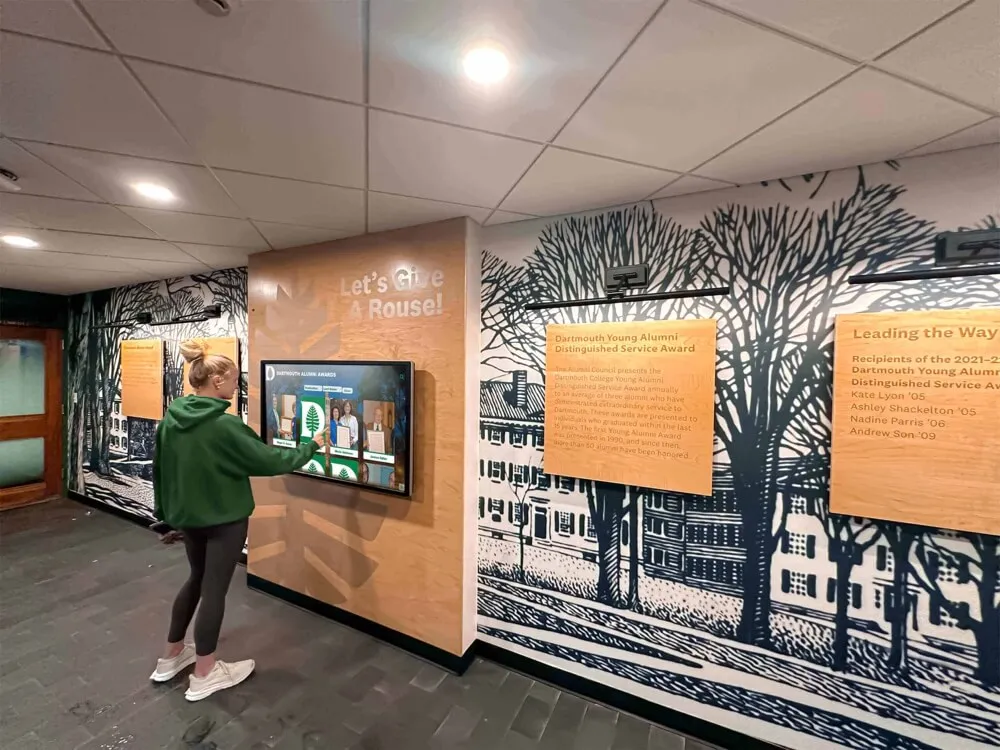
Schools that pair print yearbook traditions with permanent digital recognition create multiple touchpoints where students, families, and alumni engage with the same documented moments
Pre-Production Checklist: Locking Your Templates Before Building
Before any staff member places a photo or types a name, your templates should satisfy every item on this checklist. Running through it at the start of production prevents the structural problems that force rework late in the production cycle.
Grid and page setup
- Publisher trim size confirmed and page setup matches exactly
- All margins defined and consistent across all section templates
- Six-column (or chosen) grid applied to master pages
- Baseline grid established and body text frame snap enabled
- Bleed marks set to 0.125" on all outer margins
Type system
- Display, header, body, and caption styles defined in paragraph styles panel
- Minimum point sizes confirmed for print legibility
- Typeface families limited to two per book (display and text)
- All styles applied to template frames — not set manually per page
Section templates
- Portrait grid defined with minimum cell size noted
- Name line position and type style locked in portrait template
- Club template variants (small/medium/large) created
- Athletics opener and roster templates built as separate masters
- Senior portrait template differs visibly from underclass template
- Faculty portrait template with department grouping logic defined
- Closer spread template created before production begins
Production workflow
- Photo resolution minimums communicated to photographers and coverage staff
- Caption template with character count guidance distributed to writers
- Theme color values saved as named swatches in every template file
- Folio position and type style applied to all section masters
Theme Carrier Pages: Making Every Spread Feel Like the Same Book
One of the most common yearbook layout problems is theme drop-off — the cover and opener look connected to the theme, but by the time you reach the junior portrait section, the design feels generic. Theme carrier pages solve this.
A theme carrier page is any page that is not an opener but still carries recognizable visual markers of the book’s theme. Build these into your templates as defaults rather than treating them as additions.
Carrier elements by section type:
Portrait sections: Theme color in the folio bar and section identifier tab. A small theme graphic in the reserved decorative cell. No more than this — portrait sections need to breathe.
Club pages: Theme graphic as a background texture or border element behind the organization name. Theme color in the photo caption rule line.
Athletics: Theme color in the season record block and stat callout. Theme display font for sport names even when body text uses the standard system font.
Feature spreads: Full theme expression — color, typography, graphic elements — applied without restraint.
This graduated approach makes the book feel consistently designed without overwhelming sections where content is the priority.

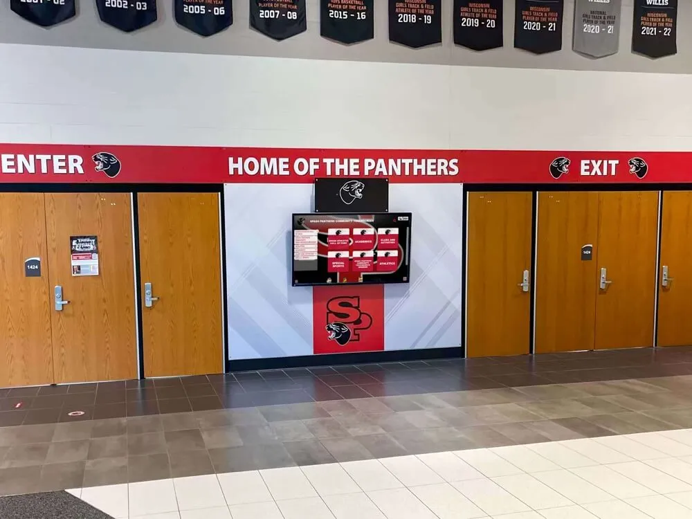
Consistent visual identity — theme colors, typography, and graphic language — should carry through every section of a yearbook just as it carries through every display in a school's recognition system
Working With Your Printer’s Template Requirements
Every yearbook printer provides its own template specifications. Use them. The PDF files or InDesign documents your printer supplies include the correct page dimensions, safe zones, bleed settings, and color profile for their press. Starting from these files instead of building from generic page settings prevents a category of press problems that have nothing to do with design quality.
Key printer specifications to confirm before building templates:
- Trim size: Exact dimensions after binding trim, not nominal size
- Bleed requirement: Usually 0.125" but confirm with your printer
- Safe zone: Area inside trim where critical content (faces, names) must remain — typically 0.125"–0.25" inside trim edge
- Color mode: CMYK for offset press; confirm profiles with your printer rep
- Image resolution minimums: Most printers specify 300 dpi at final print size for portraits; confirm their actual requirement
- Spine width: Calculated by printer based on page count and paper stock — request this before designing the cover
Review your proofs against the original templates, not against your monitor. Screen color does not match press output regardless of how well-calibrated your display is. The proof your printer sends is the reference document for final color decisions.
Section Timing and Production Schedule Integration
Layout templates do not exist in isolation — they connect directly to your production calendar. When templates are locked, you can assign coverage and content creation with accurate targets.
A practical approach: calculate content targets from your templates before assigning sections.
Example calculation for a single sport:
- One opener spread (1 anchor photo, season summary text: ~75 words)
- One roster/action spread (team portrait or individual portraits for 22 players, 3 action photos, season record block, caption for each photo)
- Content required: 25 portrait crops, 4 action photos, 75-word season summary, 4 captions at 20–30 words each
Do this calculation for every section before the school year begins. The total content target tells you how many photographers you need, how many stories must be assigned, and whether your page count matches your actual coverage plan.
Senior tribute and graduation content often needs to be planned in the fall even though the events occur in spring — layout template decisions made early shape what content staff need to gather all year.
Conclusion
Yearbook page layouts are not a design detail — they are the foundation everything else is built on. An editor who walks into production with locked templates, a defined grid, clear type rules, and section-specific frameworks gives their staff the tools to produce a professional book under deadline pressure. An editor who treats layout as something to figure out during production spends the last weeks of the cycle fixing structural problems instead of refining content quality.
Build your templates before your first production night. Test them against actual content. Audit them against your printer’s specifications. Then hold them — consistently, across every section, across every staff member’s work — and your yearbook will read as a single intentional document rather than a collection of individually designed pages.
The students documented in those pages deserve that level of care. Their portraits, their achievements, and their school year will live in those layouts for decades.
Take School Recognition Beyond the Yearbook
Discover how Rocket Alumni Solutions helps schools build interactive digital displays that extend yearbook content into permanent campus recognition — portraits, athletic records, academic honors, and class histories accessible year-round for students, families, and alumni.
Explore Digital Recognition Solutions